Why my page scrolls sideways on mobile — and how to find the culprit in a minute
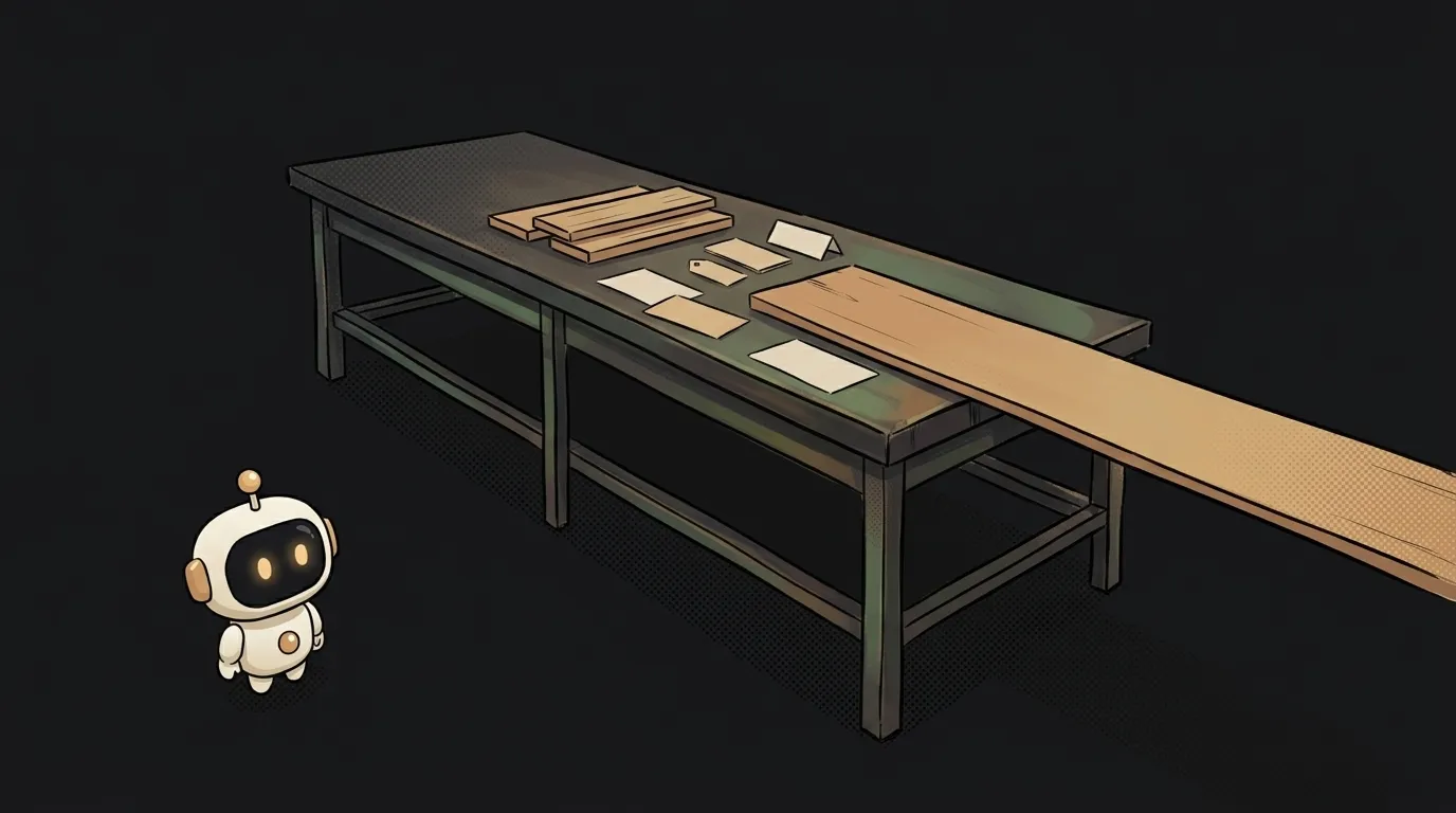
On your laptop everything is perfect. You open it on a phone — the page slides left and right, there's a strip of emptiness on the right, and you can't see what's causing it: the culprit is usually transparent or already off-screen.
Good news: there are essentially three causes, and they take a minute to find. Bad news: the most popular "fix" on the internet breaks other things — more on that at the end.
Find the culprit first, don't guess
Don't start by editing CSS. Open the page on a phone (or in the browser's mobile mode), scroll all the way left, and run this in the console:
const w = document.documentElement.clientWidth;
document.querySelectorAll('*').forEach((el) => {
  const r = el.getBoundingClientRect();
  if (r.right > w + 1 || r.left < -1) console.log(Math.round(r.right), el);
});
The snippet prints every element that sticks out past the right or left edge. You'll usually get a dozen lines — but the guilty one is the highest in the tree: the rest just sit inside it. That's the one to look at.
The no-console version is to outline everything temporarily:
* { outline: 1px solid red; }
The culprit is instantly visible: its red outline runs off the screen.
Cause 1. Something really is wider than the screen
The most common one. Candidates in descending order of popularity:
- an unconstrained image: an
imgat its natural 1200 pixels. Fixed by one global line,img, video { max-width: 100%; height: auto; }; - a hard pixel width:
width: 420pxon a card. On a 390-pixel phone that's 30 pixels over immediately. Switch tomax-width: 420px— the block narrows when it doesn't fit; - a long unbreakable string: an email, a link, a token, a file path. The browser has nowhere to wrap, so it stretches the container. Fixed with
overflow-wrap: anywhere(orword-break: break-word) on the text block; - a wide table or code block. Those shouldn't be squeezed — they should go into a wrapper with
overflow-x: auto, so they scroll instead of the whole page.
How to check: the snippet above names the element directly.
Cause 2. It's 100vw
The sneaky one. 100vw feels like "the width of the screen", but by the CSS standard viewport units are computed as if scrollbars didn't exist.
On phones the scrollbars are overlays (drawn on top of content), so there's no difference. On desktop and in some Android browsers the bar takes a real 15–17 pixels — and a block with width: 100vw ends up that much wider than the available space. Instant horizontal scroll out of nowhere.
How to check: search your styles for 100vw — especially in the "break the section out to full width" trick, margin-left: calc(50% - 50vw).
How to fix: for a block in normal flow, width: 100% is almost always enough — percentages resolve against the parent and know about the bar. If you genuinely need the full-bleed break-out, give the parent overflow-x: clip (not hidden — the difference is below).
Cause 3. A column refuses to shrink
The least obvious one — and very common in AI-generated layouts. The grid looks harmless:
.row { display: grid; grid-template-columns: 1fr 1fr; }
But inside a column there's something wide: a table, a code block, a long link. Expectation — the column shrinks. Reality — the grid runs off the screen.
The cause is a default: on flex and grid items, min-width is auto, and per the MDN docs that resolves to the min-content size — meaning the column can't get narrower than its widest unbreakable content. Not zero, the way ordinary blocks behave.
How to fix — either way works:
/* on the grid */
grid-template-columns: minmax(0, 1fr) minmax(0, 1fr);

/* or on the item */
.col { min-width: 0; }
If everything snaps into place after that, this was your cause. Remember it: it comes back every time code or a table lands inside a column.
About the "fix" that breaks other things
The first advice search gives you: put overflow-x: hidden on body. The scrolling does disappear. But hidden makes the element a scroll container — and that breaks position: sticky for everything inside: sticky headers and table headings stop sticking. The content also stays out of frame: you can still reach it by tabbing or by script, you just can't see it.
If you do need the band-aid, use overflow-x: clip: it clips the excess but doesn't become a scroll container, so sticky blocks are untouched. Support — Chrome 90, Firefox 81, Safari 16.
Still, the order is: snippet and real cause first, then clip if you truly must. Hiding the symptom leaves a block that will overflow differently on someone else's phone. The general approach to this kind of triage is in how to debug with AI.
Short version: it's not "remove the scrolling", it's "find who's wider than the screen". That's one snippet.
Why doesn't the bug reproduce in DevTools mobile mode?
Because mobile mode is a narrow desktop browser window, not a real mobile engine. Scrollbars, default fonts and browser chrome all differ there. Test on an actual phone; how to set the page up for one is in how to make your site mobile-friendly.
Can I just set overflow-x: hidden and move on?
You can, if the project has no sticky elements and you accept that some content becomes visually unreachable. Otherwise clip is safer — and fixing the cause is more reliable than either.
The scrolling appeared after I added padding — why?
Because width doesn't include inner padding by default: a block with width: 100% and padding: 20px is exactly 40 pixels wider than its parent. Fixed with box-sizing: border-box; details in the CSS box model.
Short story-lessons, an agent simulator and daily practice — in our mobile app. Free.
Read next

Why your AI agent edits the wrong file — three causes and how to check each

How to write an Agent Skill (SKILL.md) — in one evening, no code

Why my tests pass locally but fail in CI — 3 real causes
Refactor or rewrite — and why the agent always votes for the rewrite

How to review AI-generated code — and why you start with the diff