How to make a site mobile-friendly — step by step, starting with the one line everyone forgets
On a laptop your site looks great; you open it on a phone and everything's tiny — you have to pinch to read. And here's what many don't know: this isn't "rewrite the whole design." Nine times out of ten the culprit is one forgotten line in the page header. That's where we start.
And one thing that raises the stakes: Google indexes sites by their mobile version (it's called mobile-first indexing) — even when someone searches from a computer. So "broken on a phone" isn't cosmetic. It's what Google considers your site. Let's fix it, step by step.
Step 1. Add the viewport tag — that one line
Without this line, the phone thinks it's showing a "desktop" site and just squeezes the whole page down to the screen — hence the microscopic text. Open index.html and add to the <head>:
<meta name="viewport" content="width=device-width, initial-scale=1" />
This tells the browser: "lay out at the real screen width, don't scale." Often this alone takes a site from "tiny" to normal. If you built with a no-code builder or on React, the tag is usually already there — but check.
Step 2. Replace hard pixels with flexible units
The second common trouble — blocks set in fixed pixels: width: 1200px. On a 390px-wide screen such a block spills off the edge, and you get horizontal scrolling. The fix is relative values:
width: 100%instead ofwidth: 1200px— the block takes the available width rather than demanding its own.max-width: 600px— caps the block on big screens but lets it shrink on small ones.- Margins and fonts in
rem/%rather than fixedpx, where it fits.
The easiest move is to ask the AI editor: "find fixed pixel widths in the CSS and make the blocks flexible so there's no horizontal scroll on mobile."
Step 3. Add media queries for narrow screens
A media query is "if the screen is narrower than X, apply these styles." Use it for what should look different on a phone: for instance, fold two columns into one.
@media (max-width: 600px) {
  .columns { flex-direction: column; }
  .menu { display: none; }
}
Rule of thumb: build mobile-first, then use media queries to add "decorations" for wide screens. That way you're less likely to forget the phone — which is exactly what Google sees.
Step 4. Make buttons and links tappable with a finger
With a mouse it's easy to hit a tiny link; with a finger, not so much. Make clickable elements at least about 44×44 points, with breathing room between them so you don't miss. While you're at it, check the text reads without zooming — base font at 16px or more.
Step 5. Actually test the result
Don't trust your eyes — test:
- In the browser open DevTools (F12) → the phone/tablet icon at the top → pick a model (e.g. iPhone). The page will render as on a phone.
- Scroll it: any horizontal scroll, anything spilling off the edge?
- Run the site through Google's Mobile-Friendly Test or PageSpeed Insights — Google will tell you straight what it dislikes on mobile.
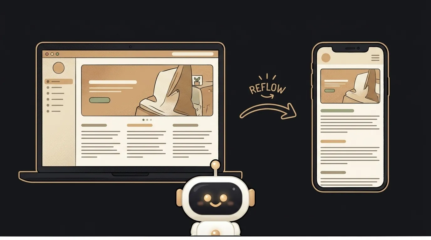
What you'll get: a site that rearranges itself for any screen — both for a person on a phone and for the search bot, which now sees a clean mobile version.
Once the mobile version is in order, it's worth circling back to SEO and meta tags — responsiveness and speed work on your ranking together.
Is the viewport tag alone enough?
It often solves the main problem — microscopic text. But if fixed pixel widths remain in the markup, you'll get horizontal scrolling, and the tag won't remove that. The viewport tag is the mandatory first step, not the only one.
React / a ready template — isn't that already responsive?
Usually starter templates and UI libraries are responsive out of the box, and the viewport tag is in place. But the moment you add your own markup with hard pixels, responsiveness breaks locally. So you still need to check in DevTools — regardless of whether it's React or plain HTML.
How is "responsive" different from a "mobile version" of a site?
Responsive is one site that rearranges to fit the screen width. A separate "mobile version" is a second site (often m.site.com) you have to maintain in parallel. Today responsiveness is almost always the choice: one codebase, one link, and Google prefers it.
Short story-lessons, an agent simulator and daily practice — in our mobile app. Free.
Read next

What a 500 error means and how to fix it: 3 causes to start with

How to use Git as a beginner — step by step, and why it's a time machine for code

How to fix a CORS error — 3 causes and the fix for each

How to debug with AI — 5 steps so it actually helps instead of guessing

How to buy and connect a domain — step by step, and why it doesn't open right away