Checkbox vs toggle switch — which to use, and why a toggle with a Save button lies
You ask an AI to build a settings page. It adds cute toggles: "Notifications", "Dark theme", "Newsletter". And at the bottom — a "Save" button.
A person clicks the "Dark theme" toggle. The toggle slides right and lights up. The theme stays light. They click again. Then they close the page without ever pressing "Save". Settings lost.
The problem isn't the code. The problem is that the toggle promised something it didn't do. Let's sort out where each control belongs.
The main difference
On the surface both do the same thing: "yes" or "no". But they promise different things.
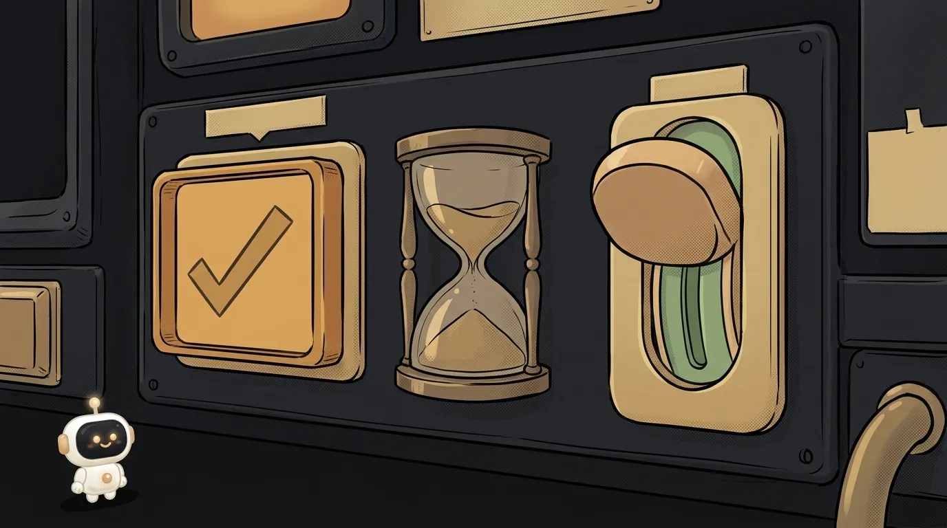
- A toggle is like a light switch. Flip it — the light is on immediately. No "confirm".
- A checkbox is like a tick on a paper form. Ticking it is just your choice for now. It takes effect when you submit the form.
This isn't a matter of taste. Usability researchers at Nielsen Norman Group put it bluntly: a toggle should have an immediate effect. If people have to press "Save" or "Submit", use a checkbox.
Hence a one-line rule: there's a submit button — checkbox. No button, action is instant — toggle.
Comparing by criteria
No table here — let's go through the points that actually affect the choice.
- When it takes effect. Toggle: right after the click. Checkbox: after the form is submitted.
- How many options. Toggle: one independent setting. Checkbox: you can build a list where people tick several items — "which topics interest you".
- How the state reads. Checkbox: the tick is there or it isn't — clear without hints. Toggle: "on" shows through position and color, which reads worse. Especially with no label or colors that barely differ.
- In-between state. A checkbox can be "partial": "Select all" when only some items are ticked. A toggle can't.
- Where it feels natural. Toggle: settings screens, especially on phones. Checkbox: forms, filters, consents.
- In HTML. A checkbox is the native
input type="checkbox". A toggle is usually drawn from that same checkbox withrole="switch"added, so a screen reader announces "switch". Safari has a built-in version since 17.4:input type="checkbox" switch. Other browsers don't support it yet and show a plain checkbox instead.
Three traps AI sets for you
A toggle in a form with a "Submit" button. The most common one. A "Subscribe to newsletter" toggle in a sign-up form. The person thinks they subscribed the moment they clicked. Swap it for a checkbox.
A toggle for consent. "I accept the terms" isn't a setting you turn on and off. It's a tick on a form. Checkbox only.
An "ON / OFF" label next to the toggle. "OFF" can be read two ways: "it's off right now" or "press to turn off". Let the label name the setting itself — "Order notifications" — and let the toggle's position show the state. How to write labels like that is covered in the piece on microcopy.
Which one fits whom
No "it depends" — here's a straight verdict.
- Building a settings page where everything applies instantly — toggles. Dark theme, sound, notifications. Flip it, see the result. If you're adding a dark mode, a toggle for it is the perfect case.
- Building a form with a "Save" or "Submit" button — checkboxes only. Even if it's profile settings.
- Need to pick several items from a list — checkboxes. Toggles aren't made for that.
- Need to pick one option out of several — neither. That's radio buttons or a dropdown, which we compared in dropdown vs radio buttons.
And one line in your prompt saves you a redo:
Build a settings page with switchesBuild a settings page. Settings that apply instantly (theme, sound, notifications) should be toggles with role="switch" and no save button. Profile settings that go to the server via a Save button should be plain checkboxes. Each label names the setting itself, not the on or off state.Is a toggle just a pretty checkbox?
In code — often yes, inside it's the same input type="checkbox". But for a person they're different promises: a toggle promises an instant result. So choose by behavior, not by looks.
What if the toggle's action takes time?
Show the progress right on the toggle — a small loading indicator. If saving fails, flip the toggle back and explain why. Otherwise the person will assume it's on.
Can I mix toggles and checkboxes on one page?
Yes, as long as they behave differently and it's visible. For example, a block of instant settings with toggles at the top and a separate form with checkboxes and its own "Save" button below. Mixing them inside one form is a bad idea.
The AI Architect 2027 course: step by step from computer basics to your own app and first customers. 543 short lessons on your phone.
Read next
Ed25519 vs RSA — which SSH key to choose in 2026
What is sudo — and why it asks for your password, not the admin's
What is a tar.gz file — and why a tar archive can be bigger than the files
What is a command-line flag — and why git commit -ma breaks but -am works

scp or rsync — and why rsync sent 141 bytes instead of two megabytes the second time