#interface
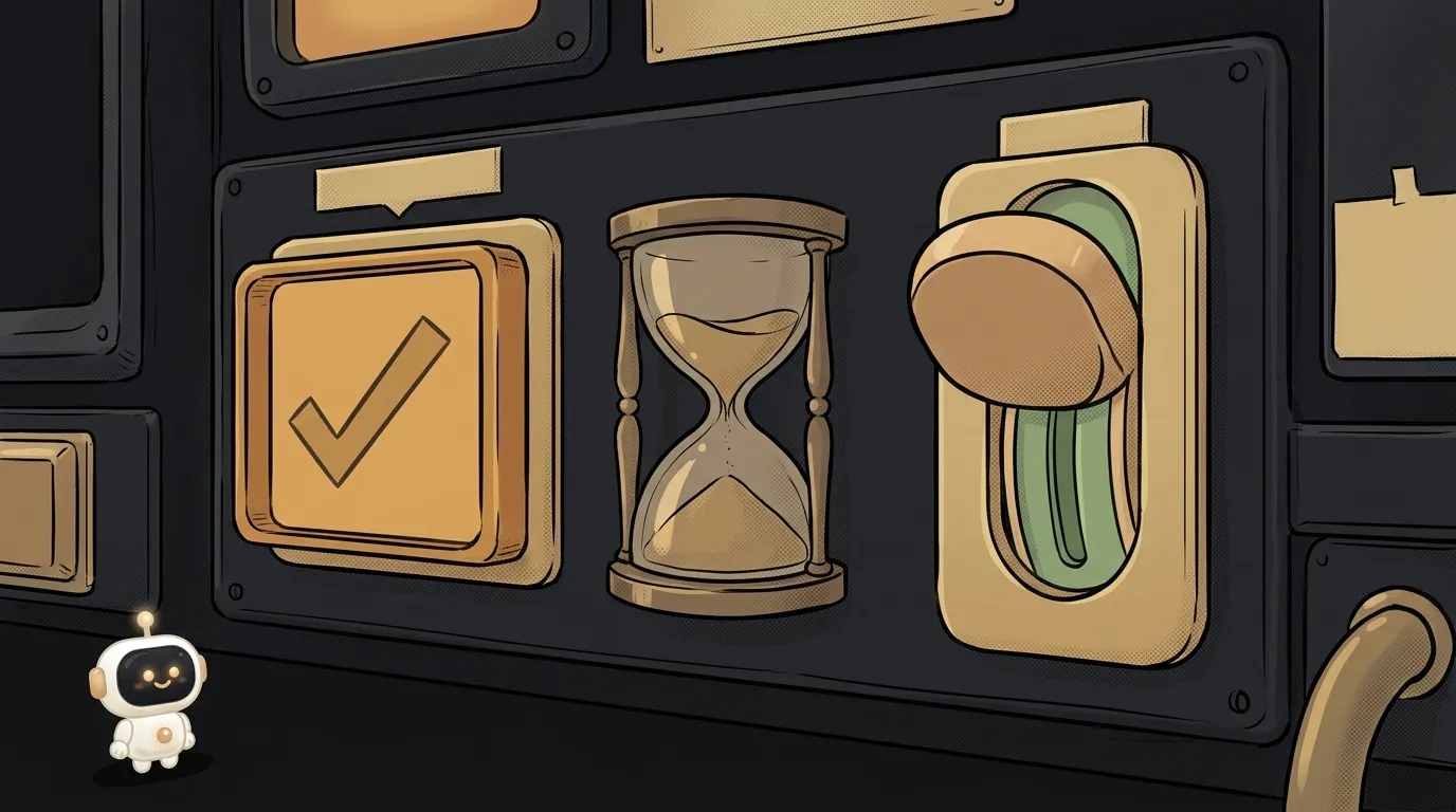
Checkbox vs toggle switch — which to use, and why a toggle with a Save button lies
Checkbox vs toggle switch: how they differ, when to use each in forms and settings, and one rule that clears up almost every doubt about which one to pick.

interface vs type in TypeScript — which to pick, and why two interfaces silently merge
interface vs type in TypeScript: what the difference is and which one a beginner should pick. A criteria breakdown, the official docs' rule of thumb, and the interface merging trap.

What is state — and why a button doesn't "turn" grey
State is everything your app remembers between two clicks. What state is in plain words, and why interfaces break wherever one truth is stored twice.

Dropdown or radio buttons — which to use in a form
Dropdown vs radio buttons compared on the criteria a beginner can actually see: taps, visible options, small screens — plus a straight rule for choosing.
What is progressive disclosure — and why a hidden button makes an interface clearer
Progressive disclosure means deferring rare features to a second level. Here's why it speeds beginners up, the two conditions it needs, and where it breaks.
What is microcopy — and why one line next to a field kills a wave of errors
Microcopy is the small text in an interface: buttons, field labels, errors. Here's why one line beats a redesign, and the four places it matters most.

What is a dark pattern — and why interfaces now cost companies billions
A dark pattern is an interface that pushes you into a decision you didn't want. The types, the regulators' fines, and how not to ship one by accident.

Placeholder vs label — which to use in a form (and why grey text inside loses submissions)
A placeholder saves space but disappears as you type. We compare placeholder vs label on six criteria and give a straight answer on what to use.

How to rewrite UI text with AI — step by step, with a ready-made prompt
By default a model writes 'Oops! Something went wrong'. Six steps and a ready prompt to get buttons and error messages that actually help people.

Why users don't see my error message — 3 causes and how to check each
"I clicked and nothing happened" — yet the error is displayed. Three reasons your error message never reaches the user, and a one-minute check for each of them.
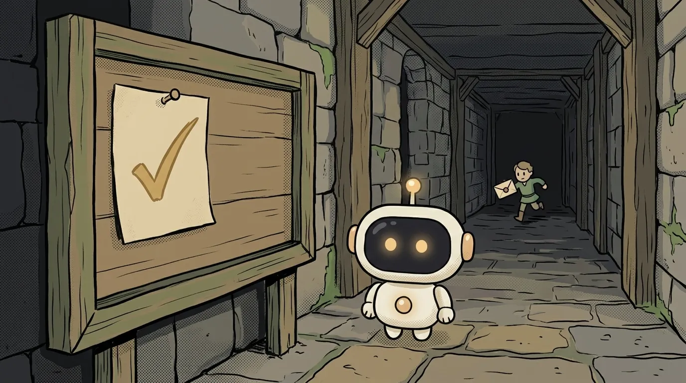
What is optimistic UI — and why the like registers before the server answers
What optimistic UI means in plain words: the app shows the result before the server confirms it. Why teams do it, and how to roll it back without losing the user.

What is an empty state — and why it's the first screen every user sees
What an empty state is and how to design one: the three kinds of emptiness, the mistake beginners make, and what to write instead of "No data".
What is a toast notification — and why some people will never see it
What a toast notification is: a small panel that pops up and disappears on its own. When it fits, how long to keep it, and who never gets to read it at all.
Toast or inline error — where to show it so people actually fix it
Toast vs inline error, compared on visibility, accessibility and message length. A straight answer on where form errors belong and when a toast is the right call.
How to replace "Are you sure?" with Undo — 5 steps and a working setup
How to add an undo action instead of a confirmation dialog: five steps with code — a delete flag, instant removal, the undo window, and what to do with timers.

What is a screen reader — and why it doesn't read the page top to bottom
A screen reader turns your markup into speech. Here's how people actually use it: 72% jump between headings instead of listening straight through.

Skeleton or Spinner — What to Show While Loading, and When to Show Nothing
Skeleton or spinner: compared on wait length, layout shifts and accessibility — with a straight answer on which to pick in each situation.
How to Add a Loading Skeleton — Six Steps and the One Detail Everyone Forgets
Step by step: how to build a CSS loading skeleton without a layout jump, without flashing on fast responses, and without breaking accessibility.

How to Describe a UI to AI — 6 Steps From «Make It Pretty» to a Working Screen
How to describe an interface to AI and get a working screen, not a picture: structure over taste, states, and tokens. Six steps with a ready prompt example.
What is web accessibility (a11y) — and why AI-generated interfaces break it first
Web accessibility means your site still works without a mouse and without sight. Here's where AI markup breaks it, and how to check your own in two minutes.