What is web accessibility (a11y) — and why AI-generated interfaces break it first
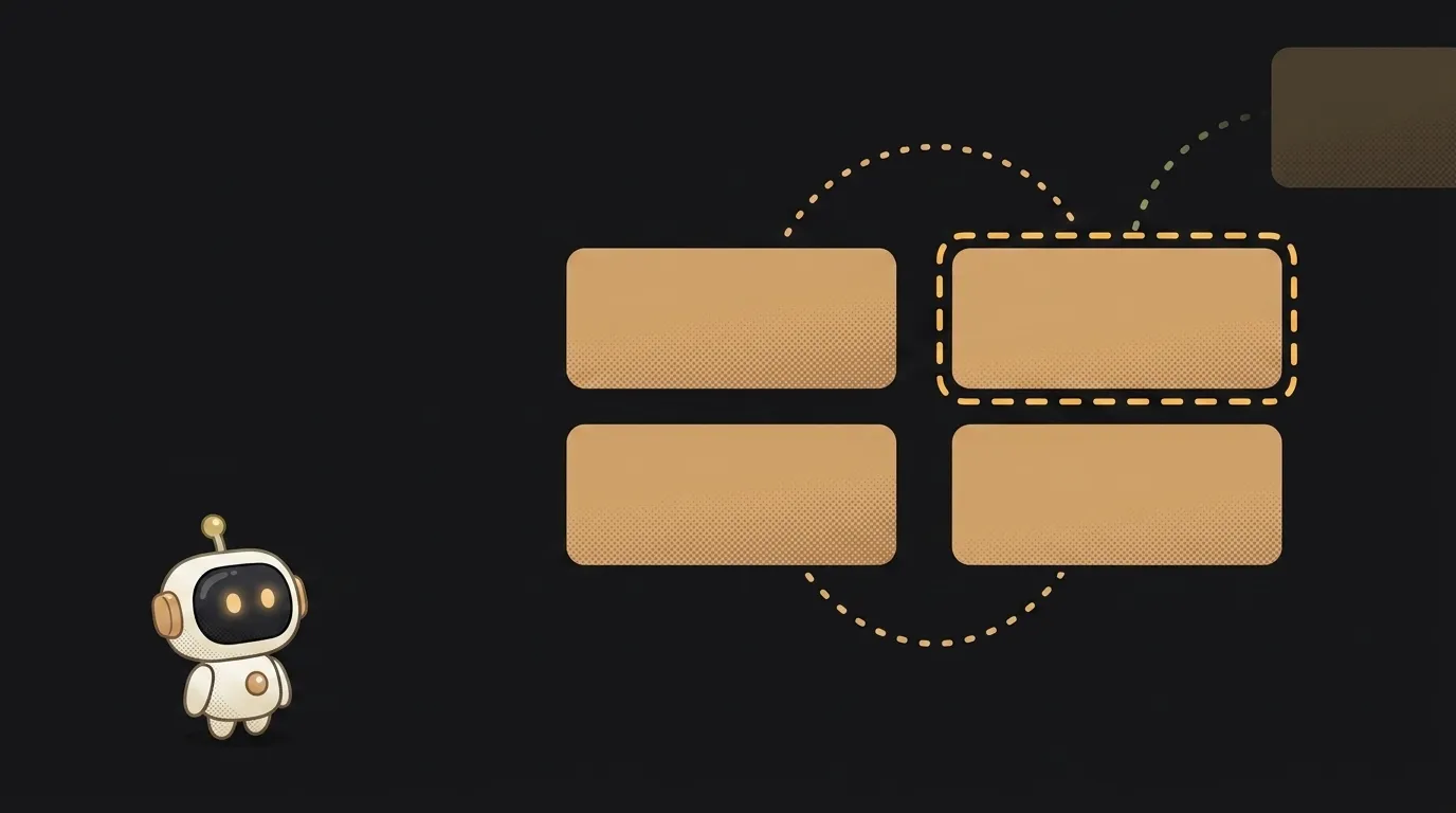
Try this right now: open your site and take your hand off the mouse. Tab and Enter only.
Odds are you get stuck within three presses. The Submit button never highlights, the modal won't close, focus flies off somewhere past the screen. And yet with a mouse everything worked perfectly — you tested it.
That's accessibility. Or rather, the lack of it.
What web accessibility is
Accessibility (a11y — "a", eleven letters, "y") is an interface staying usable when someone doesn't have the thing you silently assumed: a mouse, sight, hearing, steady hands, or a calm environment.
The key word is "silently". Nobody builds a site thinking "blind people can get lost". You just built the interface while looking at it — and quietly baked in a requirement to look.
The rules for this have been written down for years and are called WCAG. Sounds intimidating; for a first project it's literally five or six things.
Why AI markup breaks accessibility first
Models were trained on millions of pages from the internet, and the average page on the internet isn't a paragon of accessibility. On top of that, AI optimises for what shows up in a screenshot. The result is three mistakes present in nearly every generated interface.
1. <div> instead of <button>. The most common one. Visually identical: same rectangle, same click handler. But all the browser knows about a <div> is that it's a box. In the DOM it has no button role: Tab skips it, Enter and Space do nothing, and a screen reader announces it as empty space. A real <button> gets all of that for free.
2. Beautiful grey text. Models adore #999 on white — it looks airy. That pair has a contrast ratio of about 2.9:1, while the standard's minimum for body text is 4.5:1 (3:1 for large text). On a good monitor in a dark room you won't notice. On a phone in sunlight the text simply disappears.
3. Images with no description. AI drops in <img src="hero.png"> and moves on. To someone using a screen reader, that image is just the word "image". And if the picture is decorative, the right answer isn't to invent a description — it's an empty alt="", so the reader skips it silently instead of spelling out the filename.
Three checks, two minutes
This is the practical minimum. You don't need to install anything.
- Drop the mouse. Tab through the page start to finish. Can you see where you are? Can you reach every button and link? Does Esc close the modal? If focus vanishes, hunt for a
<div onclick>or anoutline: nonein your styles. - Check contrast. In the browser: right click → Inspect → select the text and open the colour swatch. DevTools shows the contrast ratio and whether it passes. If it doesn't, just darken the colour.
- Turn images off. Disable image loading in DevTools (or just read the source). Whatever's still readable is roughly what a screen reader "sees". Blank gaps where buttons and captions should be — that's your to-do list.
Two minutes, and it catches maybe eighty percent of the usual problems. Add it to your pre-launch checklist — that's where it belongs.
This isn't "a small group of users"
The WHO estimates that roughly one in six people lives with a significant disability. But the number isn't really the point.
Accessibility is almost always about a situation, not a diagnosis. You were a "user with constraints" today: watching video muted on the train, poking at your phone one-handed with a bag in the other, reading a screen in bright sun, tapping around a cracked digitiser. Every one of those times, somebody's margin of safety in the interface saved you.
There are pleasant side effects too. Proper headings and alt text are literally what search crawlers read, so accessibility drags SEO along with it. And the habit of not relying on a mouse pairs neatly with responsive layout — on a phone there's no mouse at all.
One more thing: since mid-2025 the European Accessibility Act applies in the EU, setting accessibility requirements for digital products and services on that market. If you ever want to sell your app in Europe, building this in now is far cheaper than retrofitting later.
What does a11y mean in plain words?
It's shorthand for accessibility: the letter "a", eleven letters, the letter "y". It means an interface usable by people with any constraint — from blindness to a broken arm.
Is adding alt text to images enough?
No, but it's a good start. The minimum set is semantic tags (<button>, <nav>, headings in order), a visible keyboard focus, 4.5:1 contrast, and form fields labelled with <label>.
What can check accessibility automatically?
Lighthouse built into Chrome (the Accessibility tab) or the axe DevTools extension. Just remember: automation catches maybe a third of the issues — nothing replaces tabbing through the page yourself.
The AI Architect 2027 course: step by step from computer basics to your own app and first customers. 543 short lessons on your phone.
Read next
Ed25519 vs RSA — which SSH key to choose in 2026

What is sudo — and why it asks for your password, not the admin's

What is a tar.gz file — and why a tar archive can be bigger than the files

What is a command-line flag — and why git commit -ma breaks but -am works

scp or rsync — and why rsync sent 141 bytes instead of two megabytes the second time