What is a dark pattern — and why interfaces now cost companies billions
On 25 September 2025, Amazon agreed to pay the US Federal Trade Commission $2.5 billion: $1 billion in civil penalties and $1.5 billion in refunds to roughly 35 million people. Not for a data breach. Not for a broken server.
For an interface. Specifically, for how easy it was to end up in Prime and how hard it was to leave. The deal was signed three days into the trial.
Here's the surprise at the heart of this topic: "annoying to cancel" stopped being a matter of taste and became a legal category. It's called a dark pattern.
What a dark pattern is
The term was coined by Harry Brignull; his catalogue, once hosted at darkpatterns.org, is now deceptive.design — "deceptive patterns". Its definition is plain: the interface tricks people into doing things they didn't mean to, stops them doing what they wanted, or steers them into decisions they wouldn't have made deliberately.
The key words are didn't mean to. A dark pattern isn't "you were offered something". It's "the decision was made for you, by exploiting how attention works".
The line against normal design is thinner than it looks. Compare it with progressive disclosure: there you hide what's rare, so people find the frequent thing faster. A dark pattern hides what's important — the price, a condition, the cancel button. Same move, opposite direction.
Five types you'll recognise instantly
In January 2023 the European Commission, together with consumer authorities from 23 EU countries plus Norway and Iceland, screened 399 online shops for three specific tricks. At least one showed up in 148 of the 399 — close to forty percent. Those three, plus two more classics:
- Fake countdown. A timer "until the offer ends" that resets to the top afterwards, with the price unchanged.
- False hierarchy. One option is a big bright button, the other a grey line below. The choice formally exists; visually it doesn't.
- Hidden information. A condition set in tiny type, low contrast, or parked where nobody will read it.
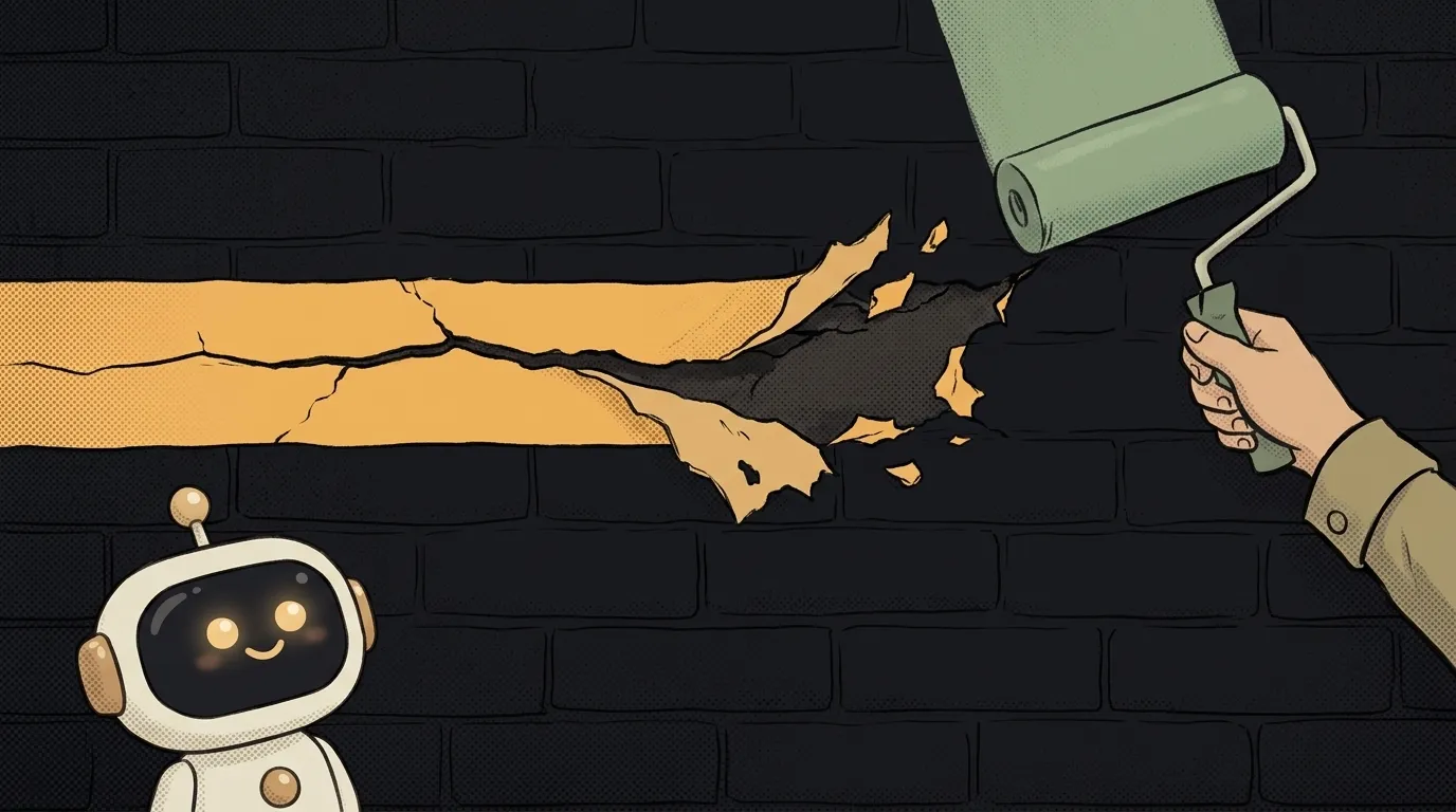
- Roach motel. Subscribing takes two clicks; cancelling takes an email to support. That's exactly the Amazon case.
- Confirmshaming. The decline button reads like "No thanks, I don't want to save money".
What the law says
The EU has an outright ban — Article 25 of the DSA: platforms must not design or operate their interfaces in a way that deceives or manipulates people, or otherwise materially distorts their ability to make free and informed decisions. The same article lists the practices the Commission may issue guidance on:
- giving more prominence to certain choices when asking someone to decide;
- repeatedly asking for a choice already made, especially through pop-ups;
- making cancellation harder than signing up.
The US story is more instructive. The "cancel as easily as you subscribed" rule (click-to-cancel) was struck down in July 2025 — and note, on procedural grounds: the commission skipped a required economic analysis. The substance never went away: on 30 January 2026 the FTC restarted the rulemaking, comments ran to 13 April 2026, and enforcement under the existing subscription law continued throughout. Epic Games' $245 million penalty in 2023 came from the same family: an interface where children racked up unwanted charges.
How not to ship one by accident
Small products land here out of inertia, not malice: everyone does it that way, the template suggested it, the AI generated a screen with a bright yes and a pale no. Three checks worth running on any screen of yours:
- Symmetry of cancellation. Count the clicks to subscribe and the clicks to cancel. If the second number is bigger, that's fixable, and fast. Especially relevant if you're just adding payments.
- Symmetry of choice. Cover the text and squint at the screen. If you see one button where there should be two, the choice is framed dishonestly.
- Honest timers and checkboxes. The countdown reflects a real deadline. The "subscribe me" box is unchecked by default. The cookie banner lets people refuse in one click, not via "manage preferences".
What if I just emphasised the "Continue" button?
Emphasising the primary action is fine — interfaces are supposed to be legible. The problem starts when the alternative is camouflaged: made invisible, renamed into something unclear, or buried behind an extra screen.
Does this apply to me with a hundred users?
Legal exposure depends on scale and jurisdiction, but EU rules look at where your users live, not at how big you are. And the practical part already pays off at a hundred: one-click cancellation is cheaper than a stream of support tickets and chargebacks.
How do I audit my own interface in an evening?
Walk your flow as someone who changed their mind: sign up, subscribe, then try to cancel and delete everything. Write down every place you had to hunt. That list is your fix plan — and while you're in there, check the wording against the microcopy rules.
Short story-lessons, an agent simulator and daily practice — in our mobile app. Free.
Read next
What is a git worktree — and why keep a second folder of the same project
What is state — and why a button doesn't "turn" grey
What is a regression — and why a fixed bug comes back
What is a dependency — and why one library pulls in two hundred
What is a variable — and why a copy of a list changes together with the original