Skeleton or Spinner — What to Show While Loading, and When to Show Nothing
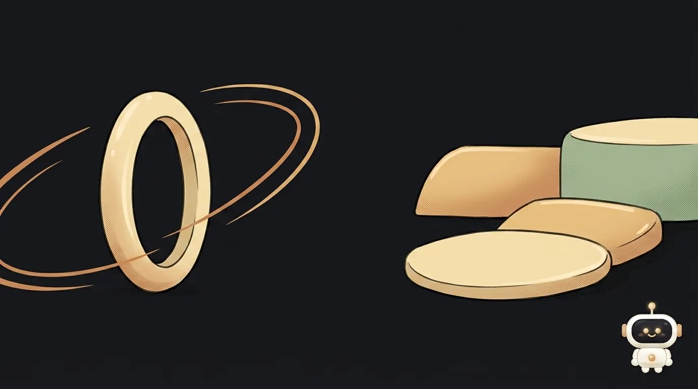
The data takes a second to arrive. What goes there in the meantime — a spinning ring or grey rectangles? The argument looks like taste, but it has a boring technical answer.
Look: these two say different things. A spinner says "the system is alive, I'm working." A skeleton says "an avatar goes here, two lines of text here, an image there." One is about the process, the other about the result. That's where the choice comes from.
What the two actually are
A spinner is a looped animation with no beginning or end: a ring, dots, a bar. It shows no progress, only busyness.
A skeleton is a mock-up of the coming content made of grey blocks that copy its shape and size.
They share one thing: neither knows how long the wait will be. If you do know, use a percent-done bar — it's more honest than either.
Compared on what actually decides it
Length of the wait. Nielsen Norman Group research gives clear boundaries: under 0.1 seconds a response feels instantaneous, under 1 second the delay is noticed but doesn't break the flow of thought, and past 10 seconds a looping animation can't hold attention any more — you need percent-done. Looped animation is recommended for actions of roughly 2–10 seconds. A skeleton works in the same band, but only when you're waiting for content, not for an action.
Is the shape of the result known. You can only draw a skeleton when you know in advance what's coming: a card, a feed, a profile. If the result is unpredictable — a search that might return three rows or three hundred — drawing its shape is dishonest.
Layout jumps. Here the skeleton wins outright. It occupies the space in advance, so swapping in content moves nothing. A spinner usually sits in a small container, and after the response a full-size block unfolds in its place — the page twitches. That's a direct contribution to CLS, one of the Core Web Vitals.
How much work. A spinner is ten lines for the whole project. A skeleton has to be built per block type and kept in sync with the real markup: change the card, change the placeholder. That's a genuine maintenance cost, not a detail.
Accessibility. Both are equally useless to a screen reader: neither a rotation nor grey rectangles mean anything to it. Both need a text live region with the status. The difference is that a skeleton also litters the page tree with a dozen empty elements — you have to hide them.
Honesty. The skeleton has an ugly scenario: it drew five cards and the server returned an empty list. The person is already braced for content and gets "nothing found" instead. A spinner never made that promise.
Which to pick
No fence-sitting:
- Waiting for content of a known shape, longer than a second — a feed, a product list, a profile, a dashboard: skeleton. It doesn't save time, it saves nerves: the page doesn't jump and the eye knows where to look.
- Waiting for an action to finish — saving, submitting a form, paying: spinner, ideally inside the button that was pressed. There's no result shape to draw; what matters is "your press was accepted".
- Waiting under a second — nothing. An indicator that flashes for two frames reads as a glitch. Just show the result.
- Waiting longer than ten seconds — neither: you need percentages, or at least stages ("compressing", "uploading", "done").
- Waiting for an AI model's answer — neither: turn on streaming and show the text as it's generated. Why that feels faster is covered in why AI answers are slow.
A third option: show no wait at all
The most underrated move. For many actions the result is predictable in advance — the like will register, the task will get checked off, the item will land in the list. Then you need neither spinner nor skeleton: change the interface immediately and send the request in the background. If the server errors, roll it back and say so.
This is called an optimistic update. It's honest in exactly one case: when failure is unlikely and easy to undo. Don't do it for payments — there a person must see that the money is still in flight.
And one small detail that catches a real bug: disable the button for the duration of the request. Otherwise an impatient person presses it three times and creates three orders. A spinner inside the button solves both at once — it shows busyness and physically prevents the repeat press.
Can I use both?
Then you get noise. One screen, one way of saying "wait". Mixing usually comes from indecision and looks like an inconsistent interface.
Is it true that skeletons feel faster?
The "faster" feeling comes from predictability, not from the colour grey: the layout doesn't change and the eye doesn't have to re-orient. Which is exactly why a skeleton whose sizes don't match the real block kills the whole effect — and ends up worse than a spinner.
Where do I start if I have neither?
With measurement: check how long the wait really is. Under a second — add nothing and go fix the request itself. Longer — build a skeleton following the step-by-step guide.
The AI Architect 2027 course: step by step from computer basics to your own app and first customers. 543 short lessons on your phone.
Read next
Ed25519 vs RSA — which SSH key to choose in 2026
What is sudo — and why it asks for your password, not the admin's
What is a tar.gz file — and why a tar archive can be bigger than the files
What is a command-line flag — and why git commit -ma breaks but -am works
scp or rsync — and why rsync sent 141 bytes instead of two megabytes the second time