How to Add a Loading Skeleton — Six Steps and the One Detail Everyone Forgets
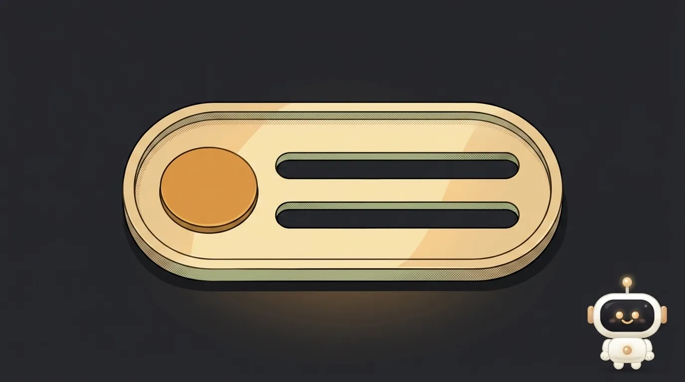
A skeleton is the grey rectangles standing in for content that's still on the way. Looks simple, builds in an evening, and breaks in half the projects the same way: the skeleton is one size, the content another — and the page twitches at the exact moment of swap. So you added a waiting animation and ruined your stability metric along with it.
Let's build it properly. Six steps below; almost everyone skips the fourth and fifth.
Step 1. Make sure you need one at all
Not every wait deserves decoration. The classic perception thresholds from Nielsen Norman Group research:
- under 0.1 seconds — the system feels instantaneous, no feedback needed;
- under 1 second — the delay is noticed but thought isn't interrupted; usually no special indicator needed;
- over 10 seconds — attention wanders, and you need a percent-done indicator, not a looping animation.
A skeleton lives between those limits and does one job: show the shape of what's coming. If you're loading a single paragraph of text, skip it — just show the paragraph when it arrives.
Which one fits which wait is covered separately: skeleton or spinner.
Step 2. Measure the real block first
This is the key step, and it happens before you write any styles. Open the finished card and note it down: avatar height, text line height, padding, total card height.
The goal is for the skeleton to occupy exactly the same space the content will. Then the swap is invisible and nothing around it moves. If the sizes disagree, you've hand-built a layout shift — the CLS from Core Web Vitals.
For images with known proportions, an aspect ratio beats a fixed height:
.card__image {
  aspect-ratio: 16 / 9;
  width: 100%;
}
Step 3. Build the skeleton from the same boxes
Don't draw a separate "loading screen". Take the same card markup and swap the contents for grey blocks:
.skeleton {
  background: #2a2a2e;
  border-radius: 6px;
  position: relative;
  overflow: hidden;
}

.skeleton--text { height: 14px; margin-bottom: 8px; }
.skeleton--text:last-child { width: 60%; }
.skeleton--avatar { width: 40px; height: 40px; border-radius: 50%; }

.skeleton::after {
  content: "";
  position: absolute;
  inset: 0;
  transform: translateX(-100%);
  background: linear-gradient(90deg, transparent, rgba(255, 255, 255, 0.06), transparent);
  animation: shimmer 1.4s infinite;
}

@keyframes shimmer {
  100% { transform: translateX(100%); }
}
The small touch that makes it look alive: the last text line is shorter than the rest. A real paragraph almost never ends flush with the edge.
Step 4. Don't show it immediately
If the response arrives in 120 ms, the skeleton will flash — and that's more annoying than empty space. Give it a delay: show it only if the wait drags on.
let timer = setTimeout(() => setLoading(true), 300);

fetchData().finally(() => {
  clearTimeout(timer);
  setLoading(false);
});
Three hundred milliseconds is a solid starting point: fast responses get no indicator at all, slow ones get it in time.
The other half of the rule: once shown, keep it for at least half a second. A skeleton that flickers for two frames reads as a glitch.
Step 5. Announce the loading to people who can't see it
To a screen reader, grey rectangles are just noise in the page tree. Hide them and state the situation in words:
<div class="card" aria-hidden="true">
  <div class="skeleton skeleton--avatar"></div>
  <div class="skeleton skeleton--text"></div>
  <div class="skeleton skeleton--text"></div>
</div>
<p role="status" class="visually-hidden">Loading the feed…</p>
role="status" is a live region with polite announcement: the screen reader reports the change when the person is idle instead of cutting them off mid-sentence. Keep that element in the markup ahead of time rather than creating it together with the text.
Step 6. Respect reduced motion
Some people have reduced motion enabled system-wide — on iOS, Android, macOS and Windows it's a switch in the accessibility settings. For them it isn't taste, it's wellbeing: motion can trigger nausea and dizziness.
@media (prefers-reduced-motion: reduce) {
  .skeleton::after { animation: none; }
}
The skeleton stays; it just stops shimmering.
What you end up with
A person taps "load more" and, if the response is quick, simply sees cards. If it's slow, after a third of a second grey placeholders of exactly the same size appear in their place and then turn seamlessly into content. Nothing jumps, nothing flickers, and a blind visitor hears "loading the feed".
The natural next question is whether the response itself is slow: five steps to speed up your site.
The week-two mistake: the placeholder drifts from the real markup
A skeleton doesn't break the day you build it. It breaks a month later. Someone added a date line to the card, the height grew by 20 pixels — and the grey placeholder stayed as it was. The swap started nudging the page again, and nobody noticed, because on fast internet the skeleton is barely visible.
The cure isn't discipline, it's structure. Two working tricks:
- One component for both states. Instead of a separate
CardSkeleton, pass the card itself a loading flag: markup and spacing are then physically identical, and only the contents turn grey. - Sizes in a shared class. If the components must stay separate, keep line height, avatar size and padding in one place (CSS variables or a shared class) rather than duplicating numbers across two files.
The check takes thirty seconds: enable slow network throttling in devtools, reload, and watch whether the text below the block twitches at the moment of the swap. No twitch means the sizes match.
A special case: lists that load more on scroll
Here the skeleton must not replace the list — the cards already read would vanish and the scroll position would fly away. Append the placeholders at the end, right after the last real card, and replace only those.
Can I skip the shimmer animation?
Yes. A static grey block is a legitimate skeleton. The shimmer only hints "something is happening", and with reduced motion you have to remove it anyway.
How many skeletons should a list show?
As many as fit the first screen — usually three to five. Twenty grey cards look like a bug, not like loading.
What if the data never arrives?
A skeleton must not spin forever. Set a timeout and show a clear error with a retry button — an endless placeholder is worse than an honest "that didn't work".
The AI Architect 2027 course: step by step from computer basics to your own app and first customers. 543 short lessons on your phone.
Read next
Why SSH still asks for a password when your key is set up — 3 causes
How to set up ~/.ssh/config — short server names instead of long commands

Why does SSH disconnect on its own (Broken pipe) — three causes and how to fix them

How to read command help (--help and man) — and find your version's flags in a minute

Why Ctrl+C doesn't stop a program — and how one except line causes it