What is a toast notification — and why some people will never see it
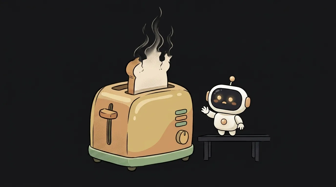
A toast is that little panel in the corner: "Saved", "Copied", "Couldn't send". It appears, hangs around for three seconds, dissolves.
Now look at what's strange about it. It is the only UI element designed to disappear before it can be read. Everything else in an app waits for the human. The toast doesn't.
Every one of its problems, and every rule for handling it, comes from that.
Where the name comes from
From a toaster: the message "pops up" from the bottom or the side, like a slice of bread. The name stuck in Android and spread to the web.
Technically a toast is a block that appears over the content, does not take focus, and leaves on a timer. Those last two points separate it from a modal: a modal blocks work and demands a response, a toast doesn't.
Hence rule one: a toast must never contain something the person is required to read. If the message is mandatory, it isn't a toast.
Who won't see your toast
Three groups, and none of them are edge cases.
People who were looking somewhere else. They pressed a button at the bottom of a long page; the toast appeared in the top right corner. Their eyes were on the button. The toast came and went in a blind spot.
Screen reader users — unless you do one specific thing. A plain block inserted into the DOM is silently ignored: a screen reader reads the page at its own pace and doesn't watch for changes elsewhere. To be announced, the message needs a live region:
<div id="toast-area" role="status"></div>
role="status" implies aria-live="polite" and aria-atomic="true" — "read it whole, but wait for a pause." The key subtlety: the empty container must already be in the markup, and the text appears inside it. Insert the whole block together with its role="status" and the announcement may never happen.
Separately: a toast shown while the page is still loading won't be announced at all — the screen reader is still building its tree and doesn't treat that as an update.
People who read slower than you. Three seconds is fine for "Copied". For a twelve-word sentence in a second language, it isn't.
How long to keep it on screen
There's no universal number, but there is a working scale:
- 2–3 seconds — short confirmation, no action: "Copied", "Saved".
- 5–7 seconds — a message with text that has to be read.
- Don't auto-dismiss at all — if it contains a button ("Undo", "Retry") or it's an error.
That last point isn't taste. In its alert pattern the W3C says it plainly: avoid designing alerts that disappear automatically, because a message that vanishes too fast breaks the requirement on time limits. Under that requirement, any timer in an interface must be possible to turn off, adjust or extend — and to extend it, a person is owed at least twenty seconds.
The practical takeaway: the moment a toast gets a button, the timer has to go — or at minimum pause on mouse hover and on keyboard focus.
What belongs in a toast
Fits: the result of a background action ("File uploaded"), confirmation of something trivial ("Link copied"), a reversible action with an undo button ("Task deleted — Undo").
Doesn't fit: form errors. Nobody can read a vanishing message in the corner and hunt for the field to fix at the same time. Criteria-by-criteria breakdown in toast or inline error.
Doesn't fit: anything needing a decision. "Delete project? Yes / No" in a toast is a trap — there's no time to answer.
Doesn't fit: a queue of five toasts in a row. Frequent interruptions hurt more than they help. If there are many events, collapse them into one: "5 files uploaded."
How not to make it worse
A few rakes almost everyone steps on:
- A toast over the button. On a phone, a bottom panel often covers exactly the button the person was aiming for. Test on a narrow screen — while you're there, check how to make your site work well on phones.
- A close button and a timer together. If the toast leaves on its own, the little cross is nearly useless: it's gone before anyone reaches it.
- A red toast as the only trace of an error. It leaves, and nothing remains. Errors need a home where they can be read calmly.
role="alert"on everything. That role isassertive: the screen reader interrupts whatever it's reading. For "Saved" that's rude. Keepalertfor real errors and usestatusfor the rest.
Is a snackbar something different?
Practically, no. "Snackbar" comes from Material Design — a panel at the bottom of the screen that may carry one action button. Android toasts originally had no buttons at all. On the web the two words have long been synonyms.
Do I need a library?
For a single message, no — a block with role="status" and a timer is enough. A library starts to pay off once you need a queue, stacking, pause-on-hover and exit animation: exactly the details a homemade version forgets.
Can I show network errors as toasts?
Yes, if there's a Retry button next to it and the toast doesn't dismiss itself. Otherwise you get the worst combination: the action didn't happen, the notice about it already evaporated, and the person is sure everything went through.
Short story-lessons, an agent simulator and daily practice — in our mobile app. Free.
Read next
What is a git worktree — and why keep a second folder of the same project
What is state — and why a button doesn't "turn" grey
What is a regression — and why a fixed bug comes back
What is a dependency — and why one library pulls in two hundred
What is a variable — and why a copy of a list changes together with the original