Why your images look blurry — 3 causes, and the first one hides in the screen
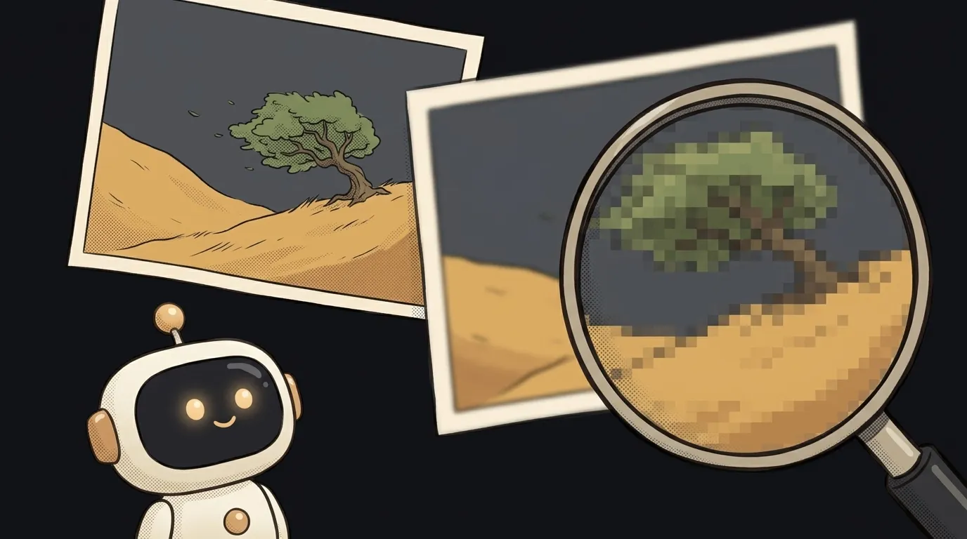
Familiar scene: everything looks crisp on the laptop, you open it on a phone and the logo is mush, the banner text has ragged edges. Same file. Better screen. Worse result.
Sounds like a paradox, but that's exactly what happens. And blur almost always comes from one of three causes. Start with the most common — the one where the file isn't at fault, the arithmetic is.
If the image isn't just blurry but missing entirely, that's a different story with its own three causes.
Cause 1: the screen draws more pixels than you gave it
Modern screens are sneaky. When CSS says "400 pixels wide", the phone doesn't draw 400 physical dots — it draws 800 or 1200. That's pixel density, the device pixel ratio (DPR). A MacBook sits at 2, most phones at 2.5–3.
Your file, meanwhile, hasn't changed. A 400-dot-wide image on a DPR 3 screen gets stretched threefold — the browser dutifully invents the missing dots. Hence the mush.
The irony: the more expensive someone's phone, the worse your site looks.
How to check
Open the browser console on your page and paste:
document.querySelectorAll("img").forEach((i) => {
  const need = i.clientWidth * devicePixelRatio;
  if (i.naturalWidth < need) {
    console.log(i.currentSrc, i.naturalWidth, "→ needs", Math.round(need));
  }
});
It compares each file's real width with how many dots the screen wants to draw. Everything it prints is being stretched.
How to fix it
Give the browser a choice with srcset:
<img src="logo-400.png" srcset="logo-800.png 2x, logo-1200.png 3x" alt="Logo" />
The browser picks the right file for the screen density on its own. A plain src counts as the 1x candidate.
The lazy version, if you'd rather not fiddle: export the image at twice the space it will occupy and display it at half size. Always works, costs a few extra kilobytes — and optimisation will squeeze those out later.
Cause 2: your logo and icons are raster files
Second most common, and it's about format.
Logos, icons, diagrams — these are shapes and lines. They have exact geometry, which means they shouldn't be stored as pixels: any pixel file eventually turns out smaller than needed.
How to check
Look at the extension. If the logo in your header is .png or .jpg, you've found it. The second tell: the blur shows up on text and thin lines while photos next to it look fine.
How to fix it
Use SVG instead of PNG. It isn't a picture but an instruction for the browser, so it redraws at any size and any density. One file for everything, no @2x or @3x.
Cause 3: the file was compressed — maybe twice
The third cause looks different. The size is right, but the image is dirty: blocky smudges around sharp edges, banding across gradients.
Those are JPEG compression artefacts. And they have a nasty property: they accumulate. Every re-save layers new ones on top of the old. Downloaded, cropped, saved, run through an optimiser — four rounds of loss.
How to check
Open the file at its direct URL, outside the page. Still blurry — the file is to blame. Clean — something in the pipeline is wrecking it: hosting settings, a build optimiser, or a CDN transform with the quality dialled too low.
The second signal is weight. A photo banner at 30 kilobytes is almost certainly over-compressed.
How to fix it
- Always edit the original, never an already-saved file.
- Keep JPEG quality around 80. Below that the blocks come out.
- Use WebP for photos: same quality, noticeably lighter, so you're not tempted to crush the compression.
- Check your build optimiser isn't set to an aggressive preset.
Special case: the image came from AI
If the picture came out of an image generator, the cause is usually fourth in order and first in surprise: the model returned a 1024 by 1024 square and you put it on a 2560-wide banner.
No optimisation saves a stretch of more than 2×. Ask the generator for the size and aspect ratio you actually need, or run the result through an upscaler — they're free and better at it than the browser.
A 30-second checklist
- Run the script from cause one — it lists every stretched image at once.
- Confirm logos and icons are SVG.
- Open the suspect file at its direct URL and compare with the page.
- Look at the weight: a suspiciously light photo is a crushed photo.
FAQ
Why is it blurrier on a phone than on a laptop?
Because phones have higher pixel density. At DPR 3 the file stretches threefold; at DPR 2, twofold. A laptop asks for fewer dots and forgives more.
Will enlarging the image in an editor help?
No. A plain editor upscale adds no detail, it only smears what's there — the file gets heavier without getting sharper. You need either a larger original or a neural upscaler that invents the detail.
Could it be the CSS?
Sometimes. If the image has a transform: scale() on it, or was stretched via width without keeping its aspect ratio, the browser interpolates pixels too. Quick test: strip the styles temporarily and view the file at its native size.
The AI Architect 2027 course: step by step from computer basics to your own app and first customers. 543 short lessons on your phone.
Read next
Why SSH still asks for a password when your key is set up — 3 causes
How to set up ~/.ssh/config — short server names instead of long commands

Why does SSH disconnect on its own (Broken pipe) — three causes and how to fix them

How to read command help (--help and man) — and find your version's flags in a minute

Why Ctrl+C doesn't stop a program — and how one except line causes it