What is a container query — the media query that doesn't look at the screen
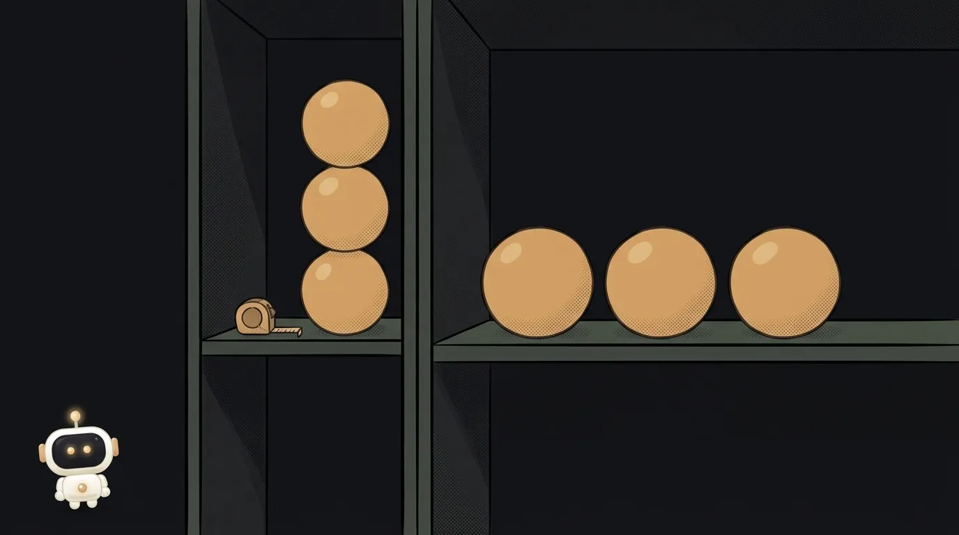
Here's a subtle one. You built a product card: image on the left and text on the right on a wide screen, everything stacked on a narrow one. You wrote a media query, checked it on your phone and your monitor, all good.
Then someone drops that same card into a sidebar. The monitor is still wide — so as far as @media is concerned, "there's plenty of room". And the card dutifully lays itself out in two columns inside a 280-pixel strip. Mush.
The problem isn't your code. A media query fundamentally can't measure the thing that matters.
A media query measures the window, not the space
@media (min-width: 600px) answers one question: how wide is the browser window. Only ever that. But a component doesn't live in the window — it lives in its column, cell or card, and that has a width of its own.
While a page was one centered column, the difference was invisible: content width ≈ window width. The moment sidebars, grids and reusable components showed up, the difference became critical. The same block has to look different in three places on one page — and the window is the same for all three.
Container queries solve exactly that: they ask about the nearest qualifying parent instead of the screen.
What it looks like in code
Two things needed. First you declare a parent as a container:
.card-slot {
  container-type: inline-size;
}
inline-size means "watch the width". Then you write the condition — almost a media query, but with the word container:
@container (min-width: 400px) {
  .card {
    display: grid;
    grid-template-columns: 120px 1fr;
  }
}
Read it literally: "if the container holding this card is 400 pixels or wider, lay it out in two columns". Now one component adapts itself in the sidebar, in the main column and in a modal. You stop tuning it per location.
You can have many containers, so they get names — container-name: sidebar, then @container sidebar (min-width: 400px). Useful once containers nest.
There are matching units too: cqi is 1% of the container's inline size (plus cqw, cqh, cqb for other axes). Handy for type that should scale with the card rather than with the window.
Two traps tutorials skip
One: an element can't query itself. @container looks at the nearest ancestor container, not at the element the rule applies to. Putting container-type and the condition on the same block won't work — you need a wrapper. That's not a bug, it's protection against an infinite loop: the rule would change the size that makes the rule stop matching.
Two: a container can collapse. container-type: inline-size turns on containment — the browser stops deriving the element's size from its contents along that axis. If the container has neither an explicit size nor one from its parent, it can collapse to zero. Practical advice: make the container an ordinary block-level element that already stretches to its parent's width, and you're fine.
And one more for later: container-type with size or inline-size creates a stacking context. If a tooltip suddenly slid under a neighbouring block right after you enabled container queries, you now know where to look.
How to move an existing component to @container
You don't have to rewrite everything at once. Take one component that already breaks in a narrow slot and do three steps.
- Find the wrapper. The component needs a parent that owns its place on the page: a grid cell, a column, a slot in the sidebar. If there isn't one, add an empty block around it. That's what gets
container-type: inline-size. - Swap the condition. In the component's styles, change
@media (min-width: 600px)to@container (min-width: 400px)— and rethink the number while you're there. This matters: the old threshold was about the window's width, the new one is about the container's. The new number is usually noticeably smaller. - Test in two places at once. Put the component on the page twice: in the main column and in a narrow block beside it. If both look right on the same screen — the move worked. That test was simply impossible to pass before.
When you actually need this
Not everywhere. Laying out the page is still @media work: how many columns the layout has, whether to show the side menu. Those are decisions about the device and the screen.
@container is about the component: a card, a widget, a comments block, a gallery tile. The tell that it's time: you catch yourself writing classes like card--narrow and card--wide and setting them by hand depending on where the block goes. That's a container query done manually.
A note on AI assistants. Ask a model to "make this card responsive" and you'll almost certainly get @media — there is thousands of times more of that code in the world. If the component is reusable, ask for a container query explicitly and say which element will be the container. This is exactly where a precise brief saves you half an hour of edits.
Support stopped being an issue a while ago: Chrome 105, Firefox 110, Safari 16 — every current browser since 2022–2023.
Short version:
@mediais about the screen,@containeris about the slot you were put in.
Can I put container-type on the element I'm styling?
No. The condition is checked on an ancestor. Wrap the component in an extra block and make that the container — a standard pattern, not a hack.
How is cqi different from vw?
vw is 1% of the window's width, cqi is 1% of the container's. In a 280-pixel sidebar, 100cqi is 280 pixels while 100vw is your whole monitor. For components you almost always want the first one.
Do container queries replace media queries?
No, they split the work. Page shell — @media; the insides of components — @container. Both live happily in one project; for building the shell, see Flexbox or Grid.
Short story-lessons, an agent simulator and daily practice — in our mobile app. Free.
Read next
What is a git worktree — and why keep a second folder of the same project

What is state — and why a button doesn't "turn" grey

What is a regression — and why a fixed bug comes back
What is a dependency — and why one library pulls in two hundred

What is a variable — and why a copy of a list changes together with the original