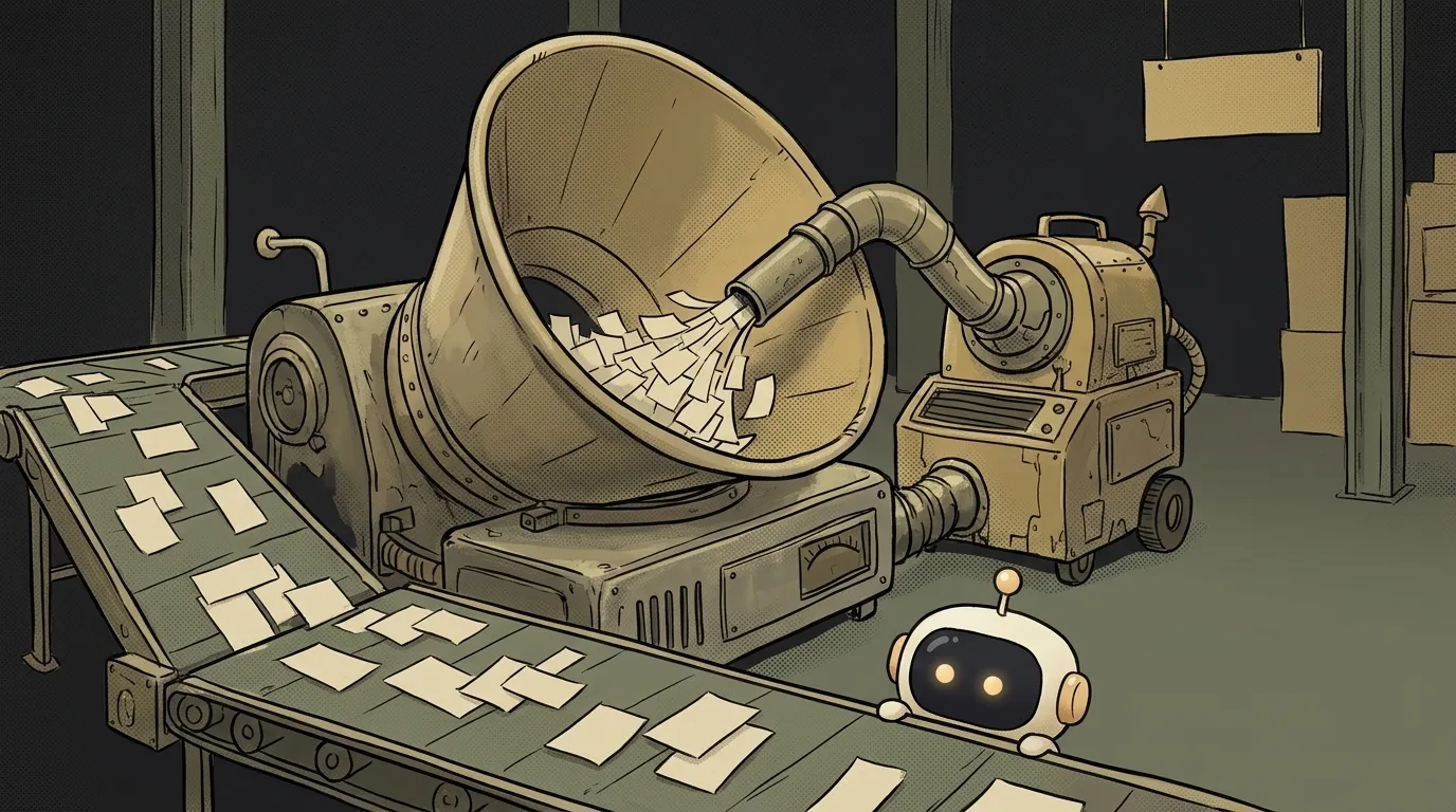
What Is a Design System — And Why It Isn't a Folder Full of Buttons
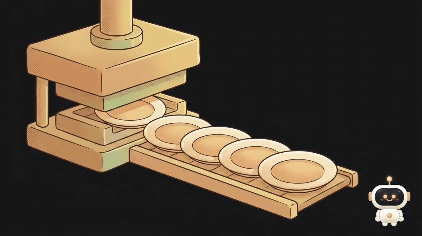
The most common mix-up here sounds like this: "a design system is a set of components." Very logical, and almost always wrong.
Nielsen Norman Group draws the line explicitly. A component library holds "predetermined, reusable UI elements." A design system is "a complete set of standards intended to manage design at scale using reusable components and patterns." The difference isn't box size. A library holds parts; a system records decisions.
And here's the unexpected part: the same NN/g writes that "a design system is only as effective as the team that manages it." So it isn't a file. It's a process with an owner.
A design system is decisions made once
Every time you build a new screen you answer dozens of small questions. How much space between blocks? What corner radius on a card? What does the button do while the request is in flight? What color is an error?
Without a system you answer them from scratch every time — and slightly differently every time. A month later your project has five shades of gray, three corner radii, and two different "Save" buttons.
A design system is where the answers get written down once and reused. Not "how it looks," but "what we decided."
How it differs from a style guide and a library
Three words people constantly conflate. NN/g separates them like this:
- Style guide — "specific implementation guidelines, visual references, and design principles." This is the brand layer: colors, typography, logo, tone of voice.
- Component library — reusable elements with descriptions, states, and code snippets. This is the assembly layer.
- Pattern library — "collections of UI-element groupings or layouts": page templates, content structures. This is the composition layer.
A design system is all three plus the rules and the person maintaining them. Remove the rules and you're left with a warehouse.
What it actually contains
Strip away the enterprise scale and the working minimum for a small project looks like this:
- Tokens — names for values: colors, spacing, font sizes, radii. This is the foundation; there's a separate piece on design tokens.
- Components — button, input, card, modal. Each with every state: default, hover, pressed, disabled, loading, error.
- Usage rules — short and strict. "One primary button per screen." "Red only for irreversible actions." "32 between sections, 16 inside one."
- Assembled examples — two or three real screens built strictly from the above.
That's it. It fits in one file and one components folder.
What people forget to include
Almost everyone documents how a component looks at rest. Almost nobody documents how it looks the rest of the time. Then every new screen re-decides what to show while a list is loading.
The minimum set of states worth pinning down once for the whole project:
- empty — what someone with no data yet sees (and that's the most common first screen for a new user);
- loading — skeleton, spinner, or nothing, and after how many milliseconds it appears;
- error — what the error text looks like and whether there's a "Retry" next to it;
- disabled — why the button is gray and whether we explain it;
- overflow — what happens to a three-line title and a two-hundred-item list.
Five lines per component. In exchange you stop reinventing them on every screen — and that reinventing is exactly what makes an app feel assembled from scraps.
Why bother if you're building solo
The argument here isn't "beauty." It's speed and AI.
When you ask a model for yet another screen, it doesn't remember the previous ones. Every request is a blank slate, so it reaches again for the most probable values: its own blue, its own radius, its own spacing. That's how you end up with an interface where every screen looks like a different app.
A design system becomes the context you paste into the prompt. Instead of "make a nice product card," you hand over a list of tokens and rules — and the model stops inventing. Missing this layer is the usual reason every AI-built interface looks the same.
Nice side effect: edits get cheap. Changing your brand color becomes one line instead of forty places in the code.
Does a small project need a design system?
A full one, no. But its core — tokens plus a list of component states — pays for itself by the third screen. Before the third screen, skip it.
Can I just use someone else's?
You can and probably should at the start: Material, shadcn/ui, ready-made kits for Tailwind. Just remember that someone else's system brings someone else's character — your product will look like every other product built on it. The cure is swapping the token layer, not rewriting components.
Is a design system a designer's job?
Usually, but not only. NN/g names a minimum team: one interaction designer, one visual designer, one developer. For a solo project that translates to something simple — you'll be maintaining it yourself, and it needs ongoing upkeep rather than a one-time setup.
The AI Architect 2027 course: step by step from computer basics to your own app and first customers. 543 short lessons on your phone.
Read next
Ed25519 vs RSA — which SSH key to choose in 2026
What is sudo — and why it asks for your password, not the admin's
What is a tar.gz file — and why a tar archive can be bigger than the files
What is a command-line flag — and why git commit -ma breaks but -am works
scp or rsync — and why rsync sent 141 bytes instead of two megabytes the second time