What is forced colors mode — when Windows repaints your website
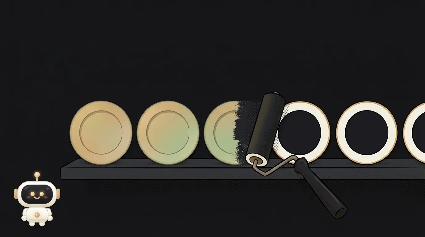
You spent a week on the palette. Soft shadows, a gradient on the button, a gray cart icon. Then someone opens the site — and sees a black background, white text and yellow links. No shadows. No gradient. The button turned into a word in the middle of a line.
Nobody hacked anything. This is forced colors mode. And people turn it on more often than you'd think: in WebAIM's 2018 survey of 248 people with low vision, every second respondent (51.4%) said they use some kind of high contrast mode. Of those, 71% pick light text on a dark background.
What it is, in plain words
Forced colors is a mode where the browser ignores your colors and paints the page with a palette the person chose in their operating system.
The best-known example is Windows contrast themes: Settings → Accessibility → Contrast themes. Microsoft also gives a quick shortcut: left Alt + left Shift + Print Screen.
The palette is tiny: background, text, links, buttons, selection, disabled items. But the contrast is guaranteed. The person picked the colors they can actually read.
How it works: what exactly the browser takes away
MDN lists the properties whose values the browser overrides right at paint time. These are color, background-color, border-color, outline-color, underline colors, and the SVG fill and stroke attributes.
A few more properties get special treatment:
box-shadowandtext-shadowbecomenone;background-imagebecomesnoneif it's a gradient, while an image loaded from a URL stays;- the browser draws a backplate behind text so words on top of photos stay readable.
The browser picks colors by what an element means. Button text gets the system button color ButtonText, a link gets LinkText, plain text gets CanvasText.
Here's the trap, especially for generated code. Meaning comes from the real tag, not from ARIA. MDN says it plainly: a div with role="button" won't get the button color. To the browser it's just text.
What usually breaks
All the common breakages are about things that relied on color alone.
- A button made of a fill. No border — the button differed from the page only by its background. The background became the system color, and the edge vanished. What's left is text among text.
- Focus and selection drawn with shadows. Did you draw the focus ring or the "selected" card with
box-shadow? In this mode the shadow is gone. A keyboard user can't see where they are. - Icons as image files. The icon file stays as it is, but the background behind it changes. A dark icon on a dark system background simply dissolves.
- Homemade checkboxes and toggles. If "on" was shown by filling a little
divsquare, both states look identical in this mode. The person can't tell whether they ticked the box. A real<input type="checkbox">gets drawn in system colors by the browser itself — the Tailwind docs even show aforced-colors:appearance-autoexample for exactly this case.
How to check in a minute and fix it
You don't need Windows to test. In Chrome, open DevTools → ⋮ menu → More tools → Rendering. Find "Emulate CSS media feature forced-colors" and pick forced-colors: active. Now walk through the page with the Tab key. Check both a dark and a light contrast theme: some people have a black background, others a white one, and different things break in each.
The fixes usually don't need a separate design.
A transparent border. Give buttons and cards border: 2px solid transparent. In normal mode you won't see it. In forced colors the browser swaps the border color for a system color — and the edge comes back. The Microsoft Edge team recommends the same trick for focus: keep a transparent outline next to the shadow.
Icons with currentColor. Draw SVGs with fill="currentColor". The icon takes the color of the surrounding text — in the light theme, the dark one and the contrast one.
Targeted tweaks in a media query:
@media (forced-colors: active) {
  .card--selected {
    border-color: Highlight;
  }
}
Highlight, CanvasText, ButtonText are system colors. You don't know what they'll be for a given person. And you don't need to: the browser fills in their choice.
MDN warns: don't build a separate design inside this query. Its job is small patches where the automatic behavior falls short. Tailwind ships a ready forced-colors: variant for this — how it compares to plain CSS is covered in Tailwind vs CSS.
A neighboring system setting your site should respect too is prefers-reduced-motion — a request to cut unnecessary motion.
Short story-lessons, an agent simulator and daily practice — in our mobile app. Free.
Can I just turn this mode off for my site?
Technically yes: forced-color-adjust: none. But then you take away a setting the person can't read without. MDN allows it only where color is the meaning itself: product color swatches, a palette in an editor.
Which system colors should I use in my tweaks?
Pick by what the element means. Canvas and CanvasText are the page background and text. LinkText is for links. ButtonFace and ButtonText are for buttons. Highlight and HighlightText are for selected things. GrayText is for disabled items. MDN has the full list.
Is it the same as dark mode?
No. In dark mode you choose the colors; in forced colors the person does. But they're connected: if the system background is dark, the browser switches on your dark theme through prefers-color-scheme by itself.
Does it work on a Mac or a phone?
Chrome, Firefox and Safari all understand the media query, but the mode itself lives mainly in Windows. For a "more contrast, please" request without swapping colors, there's a sibling query: prefers-contrast: more.
Read next

What is a git worktree — and why keep a second folder of the same project

What is state — and why a button doesn't "turn" grey

What is a regression — and why a fixed bug comes back

What is a dependency — and why one library pulls in two hundred

What is a variable — and why a copy of a list changes together with the original