Wireframe or Mockup — Where to Start If You Can't Draw
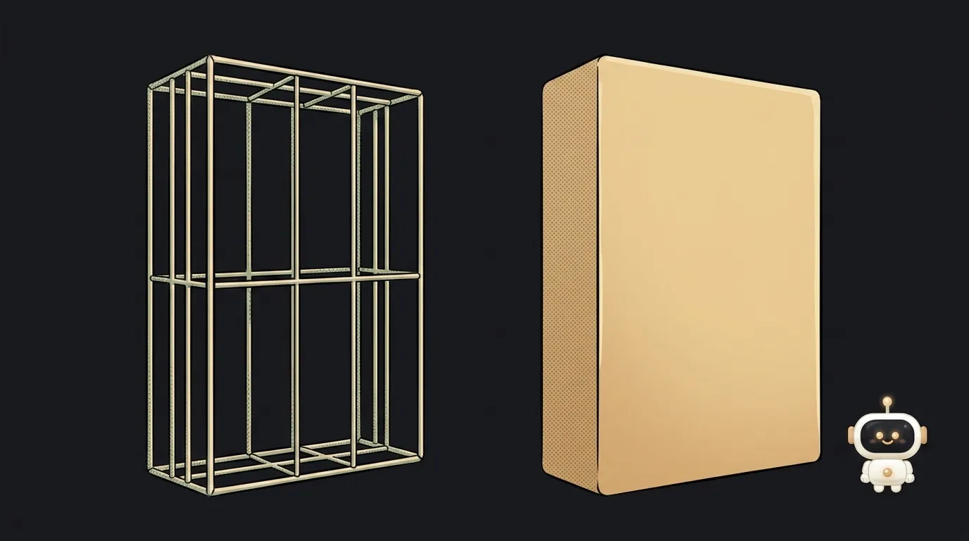
There's a counterintuitive thing worth knowing before you start drawing screens. A wireframe is gray and ugly on purpose. Not because it was rushed, and not because the author can't handle color.
Nielsen Norman Group puts the reason uncomfortably well: "Designers are more likely to want to change a sketchy design than one with full interaction and aesthetics. Once we invest more time and sweat in a design, it's harder to give it up if it does not work well."
So the ugliness is protection. From yourself.
Quick version: how they differ
A wireframe is, per NN/g, "a skeletal outline of a design layout used to represent the structure and functionality of an interface before visual design is considered." Boxes, labels, block order. It answers "what goes where, and why."
A mockup is a static picture of how it will actually look: colors, type, spacing, real copy. It answers "how does this come across."
A prototype is the same thing, but clickable. It answers "how does this feel."
NN/g frames these less as three boxes and more as a fidelity scale across three axes at once: interactivity, visuals, and content/commands. You can sit anywhere on each — a gray wireframe with real copy is perfectly normal.
Compared on what matters to a beginner
What it tests. A wireframe tests logic: are there too many steps, did the button get lost, what catches the eye first. A mockup tests impression: does it have a character, does it look cheap.
How long it takes. Wireframe: minutes, literally on paper. Mockup: hours, even with ready components.
Cost of an edit. This is the big one. Moving a block in a wireframe means erasing and redrawing. Moving a block in a mockup means redoing spacing, color, and everything that shifted. A structural mistake caught at mockup stage costs tens of times more.
What feedback you get. Also non-obvious. People criticize a rough draft more honestly: NN/g notes that with low fidelity a person feels "less obliged to be successful" and is "more likely to express negative reactions." Show a polished mockup and you'll hear "oh, nice" — and nothing about the fact that they couldn't find the main button.
What AI does with it. A model handles a wireframe better than a description of taste: structure is something you can list. Getting a mockup out of it is easy — but it will invent its own structure if you don't supply one.
Who should do what — the straight answer
- Solo, first project. Do a wireframe, on paper only. Five minutes, a pen, labeled boxes. Skip the mockup entirely — hand the wireframe straight to AI as code. The pretty middle step gives you nothing when there's no client to sign off on it.
- More than five blocks, or branching flows. Wireframe is mandatory, otherwise the model invents the structure — and it will invent the templated one.
- You need to show a client or investor. Now a mockup earns its keep: people can't look at gray boxes and picture a product. But settle the structure on a wireframe first, then render.
- Changing one button on an existing screen. Neither. Just change it.
Where AI fits in
One thing genuinely changed: mockups stopped being expensive. Tools like v0 or Lovable produce a decent screen in a minute, and the temptation to skip the wireframe is enormous.
The catch is that only the picture got cheaper. The cost of a structural mistake didn't move — it still surfaces a week later, when half your features don't fit the model the model invented. And with no structure supplied, you get the most templated layout available, which is how you end up with an interface that looks like everyone else's.
The working loop today: a five-minute paper wireframe → turn it into text as a list of blocks and states → hand it to the model as code, skipping the mockup stage. How to phrase that text is broken down step by step in how to describe a UI to AI.
What's the difference between a mockup and a prototype?
Interactivity. A mockup is a picture you look at. A prototype clicks: transitions, opening menus, filling forms. You want a prototype when you're testing the flow itself, not the appearance.
Can I skip the wireframe if the screen is simple?
Yes. A login form with two fields doesn't need a diagram. Rule of thumb: more than five blocks, or transitions between screens — draw it.
What should a beginner draw wireframes with?
Paper. Seriously: it's faster than any editor, and you won't mind throwing it away — which, per the quote at the top, is the single most valuable property of a good wireframe. If you need it digital, anything with boxes and arrows works, including plain notes as a list.
The AI Architect 2027 course: step by step from computer basics to your own app and first customers. 543 short lessons on your phone.
Read next
Ed25519 vs RSA — which SSH key to choose in 2026

What is sudo — and why it asks for your password, not the admin's
What is a tar.gz file — and why a tar archive can be bigger than the files
What is a command-line flag — and why git commit -ma breaks but -am works
scp or rsync — and why rsync sent 141 bytes instead of two megabytes the second time