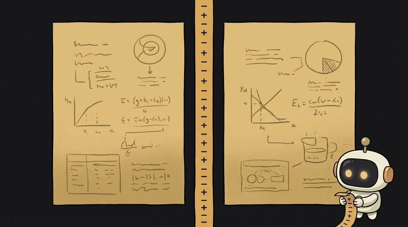
object-fit: cover vs contain — which one stops images from squashing or getting cropped
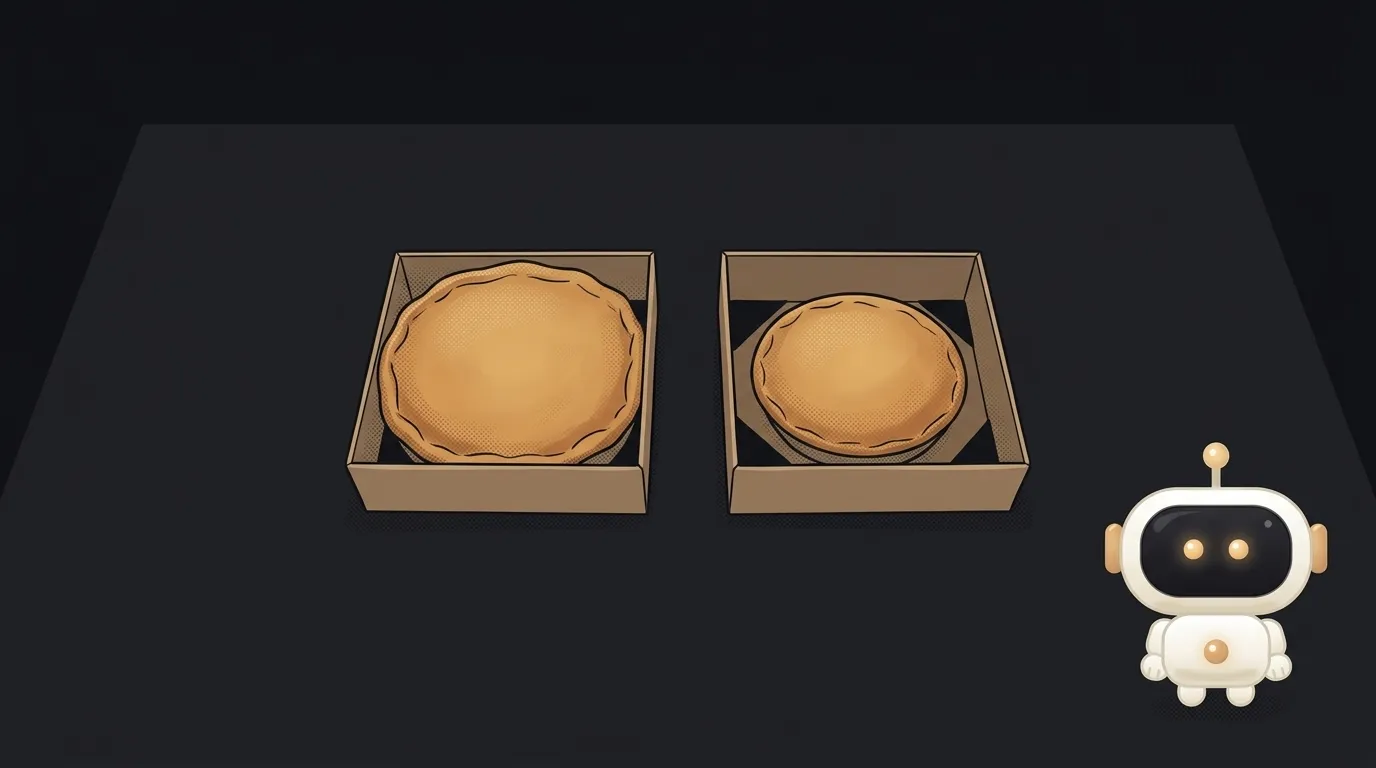
You drop photos of different sizes into cards. One gets squashed, another stretched, and your cat now looks like a dachshund. That's not a browser bug — it's the default.
The initial value of object-fit is fill. MDN puts it plainly: the image fills the whole box, and if the proportions don't match, it gets stretched. The two popular replacements, cover and contain, fix the squashing in different ways. One crops the edges. The other leaves empty bars. Let's see which goes where.
What each value does
fill— the default. Stretches the image to the box, ignoring proportions.cover— keeps proportions and fills the whole box. Whatever doesn't fit gets cropped.contain— keeps proportions and shows the whole image. Where it falls short, you get empty bars on the top and bottom or on the sides.scale-down— likecontain, but never enlarges the image beyond its real size.none— doesn't resize at all. Rarely needed: for example, to show a piece of a large image at its natural size, as if through a window.
object-fit works on replaced elements: <img> and <video>.
An important condition people often forget: the box needs its own size — both width and height, or an aspect-ratio. If the image has width: 100% and height: auto, the box takes on the photo's proportions. There's nothing to fit, and object-fit seems to do nothing.
Compared on the criteria that matter
- Losing content.
covercuts off the edges.containshows every pixel. - Empty bars.
coverhas none.containhas bars, and their color is the container's background. Set it yourself, or you'll get white on a dark site. - A neat card grid. With
cover, every preview is filled the same way, so the grid looks tidy. Withcontain, identical frames hold images of different sizes, and the row looks uneven. - Photos of people.
covercrops from the center by default: the initial value ofobject-positionis50% 50%. A portrait photo in a wide box loses the top of the head and the chin equally — sometimes the eyes too. - Products, logos, screenshots. A cropped logo or a cut-off button in a screenshot is worse than empty bars. This is
containterritory. - Small source images. Both
coverandcontainstretch a tiny image up to the box size — and it goes blurry.scale-downdoesn't blow up small images.
Which one to pick
No fence-sitting.
Pick cover when the image is atmosphere, not information. Avatars, card thumbnails, article covers, the photo on your hero screen. And add object-position right away to decide what survives the crop.
Pick contain when every detail matters. Product cards, partner logos, screenshots, diagrams, AI-generated images where the composition is the point.
Pick scale-down for things users upload: you can't know in advance whether you'll get a huge photo or a 64 by 64 icon.
A common working pattern is to use both. Thumbnails in the grid use cover, so the rows stay even. A click opens a full-screen viewer with contain, where the whole image is visible and nothing is lost.
Not sure? Use cover and immediately test the worst case: a portrait photo in a landscape box. If it cuts off the face, either move object-position or you actually need contain.
How to write it
Plain CSS for a card:
.card img {
  width: 100%;
  aspect-ratio: 4 / 3;
  object-fit: cover;
  object-position: center 25%;
}
center 25% shifts the frame up: when cropping, you keep the upper part of the photo, where faces usually are.
In Tailwind these are the object-cover, object-contain and object-top classes. Why such classes can be handier than hand-written styles is covered in Tailwind vs CSS.
In Next.js, the Image component with the fill prop needs a parent with position: relative, and you set the mode with style={{ objectFit: 'cover' }}. Without object-fit, the image stretches in that mode too.
For CSS background images, the same words live in a different property: background-size: cover or contain.
How to check your choice in a minute
Open DevTools, select the image, and change the object-fit value in the Styles panel. The image re-renders live, so you can compare options without reloading.
And don't test on one lucky photo. Take three awkward shots: a tall portrait one, a very wide one and a tiny one. AI image generators can produce images in different aspect ratios — a single gallery can easily get all three at once. If the cards look decent with all three, you've made your choice.
If your images come from users, you'll also want how to add image upload.
Short story-lessons, an agent simulator and daily practice — in our mobile app. Free.
Why isn't object-fit working?
Most often the box has no height: height: auto adapts it to the photo. Set a height or an aspect-ratio. And if the image is a div background, you need background-size, not object-fit. If nothing applies at all, go through why your CSS isn't working.
How do I make a round avatar from a rectangular photo?
A square box, cover and rounded corners:
.avatar {
  width: 48px;
  height: 48px;
  object-fit: cover;
  border-radius: 50%;
}
If the photo isn't square, the edges get cropped, but the face won't be squashed.
How do I choose which part of the image to keep with cover?
With object-position. The values work like backgrounds: top, right bottom, center 25%. The first number is horizontal, the second is vertical.
Does it work with video?
Yes. <video> is a replaced element too, and object-fit: cover is the standard way to make a video background without black bars.
Read next
What is a git worktree — and why keep a second folder of the same project
What is state — and why a button doesn't "turn" grey
What is a regression — and why a fixed bug comes back
What is a dependency — and why one library pulls in two hundred
What is a variable — and why a copy of a list changes together with the original