What are breadcrumbs on a website — and why they're not your click history
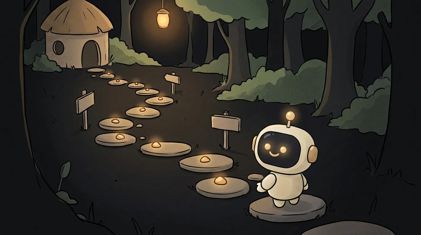
The name is misleading. The boy in the fairy tale dropped crumbs to find his way back along his own tracks. So it feels like breadcrumbs on a site should show where you've already been.
They shouldn't. Nielsen Norman Group, the best-known usability lab, says it plainly in its guidelines: breadcrumbs show the page's place in the site structure, not the session history. The browser already has a Back button for history.
And their main user isn't the person who walked in through the homepage. It's the one who landed from search straight onto a deep page with no idea where they are.
What they are
Breadcrumbs are a row of links above the page content:
Home > Shoes > Sneakers > Running
The first link goes to the homepage, each next one to a narrower section. The last item is the page you're on. The separator is usually > or /. NN/g recommends > but notes there's no functional difference.
Breadcrumbs are secondary navigation. They don't replace the main menu — they add to it.
Hierarchy, not history — and why it matters
Picture an online store. Someone searches for "wide-fit running shoes" and lands on one product page. They never saw the homepage. They haven't opened the menu.
That model doesn't fit. Now what? If the page has "Sneakers > Running", one tap takes them to the neighbouring models. If it doesn't, they close the tab and go back to search.
Now try building breadcrumbs "by history". The visitor came from search — there's no history, the trail is empty. Exactly where breadcrumbs matter most, they're useless. And for someone who wandered the site for a while, the trail turns into a long ribbon full of repeats.
That leads to the next rule. If a page lives in two sections at once (the sneakers are in both "Running" and "Sale"), pick one primary path. Don't tailor the trail to each visitor's route.
How to do it right: five rules
- Start with Home. Exception: if a Home link already sits in the header, you don't have to repeat it.
- The last item is the current page, and it's not a link. A link that leads to where you already are only confuses. Style it differently so it reads as "you are here".
- Only real pages go in the trail. If the menu has a "Networking gear" subgroup with no page of its own, leave it out. Every item should lead somewhere.
- Skip them on flat sites. A landing page, a five-page site, a step-by-step form — one or two levels deep, breadcrumbs explain nothing. A highlighted menu item is enough.
- Keep them short on phones. A trail that wraps onto two or three lines eats the screen and pushes the headline down. Tiny links packed together are hard to hit: NN/g puts the minimum touch target at about 1 × 1 cm. A common fix is showing a single step up: "‹ Running".
For mobile layout as a whole, see how to make your site mobile-friendly. And if your menu hides behind three lines, breadcrumbs get even more useful — the reasons are in our piece on the hamburger menu.
What it looks like in code
The W3C guide to ARIA patterns describes the accessible markup: breadcrumbs sit inside a labelled nav, and the current page gets aria-current="page".
<nav aria-label="Breadcrumb">
  <ol>
    <li><a href="/">Home</a></li>
    <li><a href="/shoes/">Shoes</a></li>
    <li><a href="/shoes/running/">Running</a></li>
    <li aria-current="page">Stride 3 sneakers</li>
  </ol>
</nav>
An ol list, because order matters. A screen reader will say roughly "navigation, breadcrumb, list of four items" — and announce separately which page is current.
Ask an AI to generate breadcrumbs and you'll almost certainly get the last item as a link and no aria-current. Check those two things first.
Breadcrumbs and Google Search
For search engines there's separate markup — BreadcrumbList in JSON-LD. Google's documentation says Search uses it to categorize the information from the page in search results.
Then, on 23 January 2025, Google removed breadcrumbs from mobile results: only the domain shows there now. The reason from their blog — on small screens the breadcrumbs got cut off anyway. Desktop results still show them, and the markup keeps working; nothing needs to change.
The takeaway is simple. Breadcrumbs are navigation for people first. The search bonus is nice, but not a reason to add them. How a site gets into search at all is covered in what is SEO.
Short story-lessons, an agent simulator and daily practice — in our mobile app. Free.
Can breadcrumbs replace the menu?
No. They only show the path up one branch and don't let you jump to a sibling section. The main menu stays; breadcrumbs complement it.
Does a landing page need breadcrumbs?
No. A one-page or flat site has no depth, and a one-item trail tells nobody anything. Breadcrumbs pay off from three levels of nesting: stores, documentation, knowledge bases.
Which separator — ">" or "/"?
Either. NN/g recommends > because it reads as a direction, but the researchers say outright that it makes no functional difference. Just use one symbol across the whole site.
Read next
What is a git worktree — and why keep a second folder of the same project

What is state — and why a button doesn't "turn" grey

What is a regression — and why a fixed bug comes back

What is a dependency — and why one library pulls in two hundred
What is a variable — and why a copy of a list changes together with the original