What is the safe area — and how one word in a meta tag hides your button under the notch
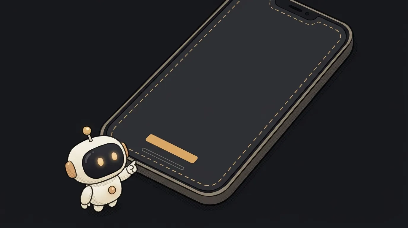
Here's a surprising thing. Safari on iPhone, by default, moves your site away from the camera notch and the rounded corners on its own. It fills the side margins with the page's background color. You don't even know you're being protected.
Then one word shows up in <meta name="viewport"> — viewport-fit=cover. You added it for an edge-to-edge image, or so Chrome on Android stops showing an extra strip at the bottom. And the protection switches off. The bottom bar slides under the home indicator; in landscape, text creeps under the notch.
To avoid that, there's the safe area.
What it is, in plain words
The safe area is a rectangle inside the screen where content is guaranteed to be visible. Rounded corners, the camera notch, the gesture bar and system bars don't cover it.
The browser reports the size of this area as four insets — top, right, bottom and left. MDN explains: if the screen is a rectangle and nothing is in the way, all four are zero. If something is in the way, it's the number of pixels you need to step back.
Think of a photo in a mat frame. The picture can fill the whole sheet, but the important part has to stay inside the window.
How it works
Two things control this behavior.
The first is the viewport-fit key in the meta tag. The default value is auto: the browser squeezes the page into the safe area itself. The value cover stretches the page to the whole screen, right to the edges.
<meta name="viewport" content="width=device-width, initial-scale=1, viewport-fit=cover">
The second is the env() function in CSS. It gives you ready-made insets: safe-area-inset-top, safe-area-inset-right, safe-area-inset-bottom and safe-area-inset-left. It arrived in iOS 11 in 2017, together with the first iPhone with a notch. Today every modern browser understands it — according to MDN, since January 2020.
A typical bottom bar looks like this:
.bottom-bar {
  position: fixed;
  left: 0;
  right: 0;
  bottom: 0;
  padding: 12px 16px;
  padding-bottom: max(12px, env(safe-area-inset-bottom));
}
Notice the max(). The WebKit team explained that a safe area inset doesn't replace your regular padding. In portrait orientation the left inset is zero, and text would stick to the edge. max() takes the larger of the two: your 12 pixels or the inset for the notch.
The same logic applies to the header and the sides. A bar pinned to the top in a home-screen app gets padding-top: env(safe-area-inset-top). And in landscape the notch ends up on the left or right — here's the example from the WebKit article:
.content {
  padding-left: max(12px, env(safe-area-inset-left));
  padding-right: max(12px, env(safe-area-inset-right));
}
The insets update on their own when the person rotates the phone. You don't need to recalculate anything.
It's not only about iPhones
Android phones have rounded corners, notches and gesture bars too. Starting with version 135, Chrome on Android can draw the page under the navigation bar at the bottom. By default it shows its own strip above it — Google calls it "the chin." It slides away as you scroll. With viewport-fit=cover there's no chin at all, and the page reaches the bottom edge right away.
Chrome's documentation warns directly: an element with position: fixed; bottom: 0 can end up under the navigation bar in this mode. The fix is the same env(safe-area-inset-bottom).
Where you'll run into it
- A bottom navigation bar or a "Buy" button stuck to the bottom of the screen.
- A chat input pinned to the bottom.
- A full-screen image or video on the first screen.
- iPhone in landscape — the notch moves to the side and cuts text on the left or right.
- A site opened from the home screen like an app: there's no browser toolbar, so nothing covers the bottom of the screen.
When you ask AI to build a mobile screen with a pinned bar, add to the prompt: "respect the safe area with env(safe-area-inset-bottom) and max()." Otherwise the bar can easily land under the gesture bar.
It's most reliable to test on a real phone, in both orientations: turn it sideways and check whether text slid under the notch. If you have a Mac, WebKit suggested another route — the iPhone simulator in Xcode: the notch and gesture bar there are the real thing. We covered the basic viewport setup in how to make your site mobile-friendly. And if your screen uses 100vh and the bottom still gets cut off, that's a separate story: why 100vh is taller than the screen on mobile.
Short story-lessons, an agent simulator and daily practice — in our mobile app. Free.
Do I need the safe area if I never set viewport-fit=cover?
Usually not: Safari moves the page in by itself. But check the color of the side margins. They're filled with the <body> or <html> background, and if it doesn't match your header, you'll get visible stripes.
What happens in a browser that doesn't know env()?
It ignores the whole rule. So put a regular padding on the line above — like the padding and padding-bottom pair in the example. env() also takes a second argument as a fallback value: env(safe-area-inset-bottom, 0px).
Why does env() return zero?
Most of the time it should. MDN explains that on a rectangular screen with nothing in the way, all insets are zero — on a desktop computer, for example. And in portrait orientation on iPhone, the side insets are zero: the notch is at the top. Test on a phone and turn it sideways.
Do native apps need this too?
Native apps have their own safe area tools on each platform. env() is for when the interface is a web page: a site, a PWA or a web app inside a wrapper.
Read next

What is a git worktree — and why keep a second folder of the same project
What is state — and why a button doesn't "turn" grey
What is a regression — and why a fixed bug comes back
What is a dependency — and why one library pulls in two hundred
What is a variable — and why a copy of a list changes together with the original